Nomenclature and Information Architecture Strategy
The background
Amazon’s Just Walk Out technology enables you to enter a store, grab what you want, and get going without stopping to check out.
It leverages computer vision, sensor fusion, and deep learning. Amazon uses this technology in several of its own store formats including Amazon Go and select Amazon Fresh and Whole Foods Market stores. Without a checkout process, you can quickly and easily get the items you need without having to wait in line.
The process to enter a Just Walk Out technology enabled store varies. To enter a store powered by Just Walk Out technology you can insert or tap a credit card at the entry gate. If the store is equipped with Amazon One, you also have the option to hover your palm over an Amazon One device at the entry gate. If the store uses a mobile app for entry, you simply scan the QR code on your device to enter.
Once in the store, you can grab what you want and your items will be added to your virtual cart. Items returned to a shelf will be automatically removed from your virtual cart. Simply take what you want from the store, leave, and your payment method will be charged after you exit the store.
Cool, so what's the problem?
Amazon doesn't accept all credit cards.
If a customer comes to the store with an unsupported card, they have no way to shop. The solution to this is to provide the customer with a Host Card Emulation (HCE) payment method.
What is Host Card Emulation (HCE) and HCE Payment?
"Host card emulation (HCE) is a technology for securing a mobile phone such that it can be used to make credit or debit transactions at a physical point-of-sale (POS) terminals. With HCE, critical payment credentials are stored in a secure shared repository (the issuer data center or private cloud) rather than on the phone. Limited use credentials are delivered to the phone in advance to enable contactless transactions to take place."
⬆ That sounds complicated
So how do we explain it to customers quickly, simply, and in a way that doesn't make them feel like they're being tricked into signing up for a credit card like I did at The Gap when I was 17?
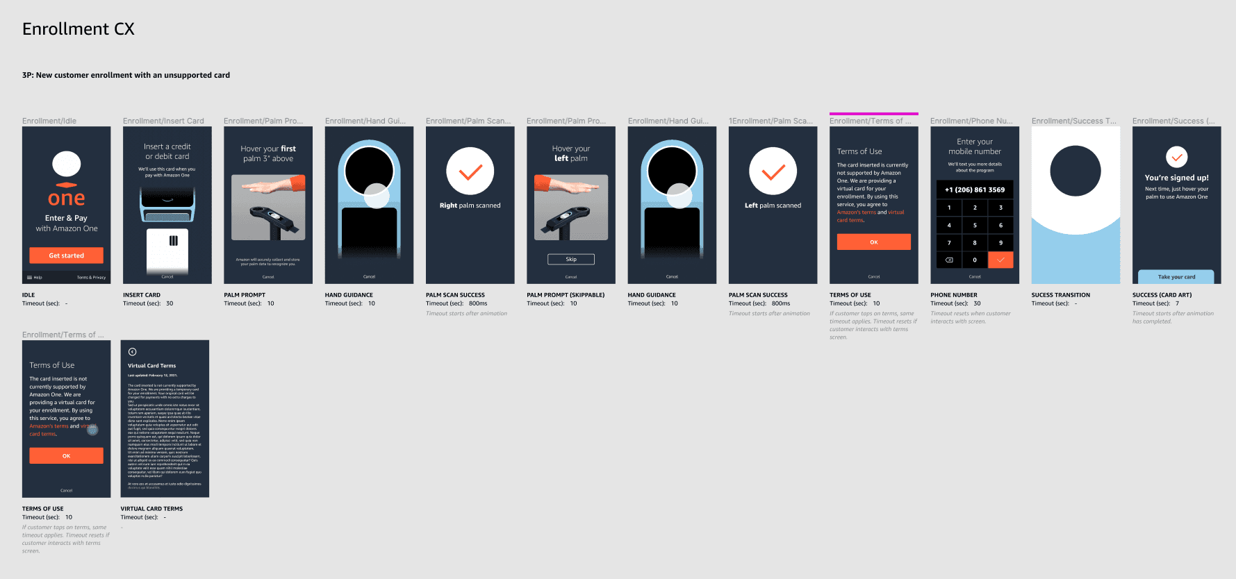
Well first, let's go through the usual happy path of enrollment:
Where it goes wrong:
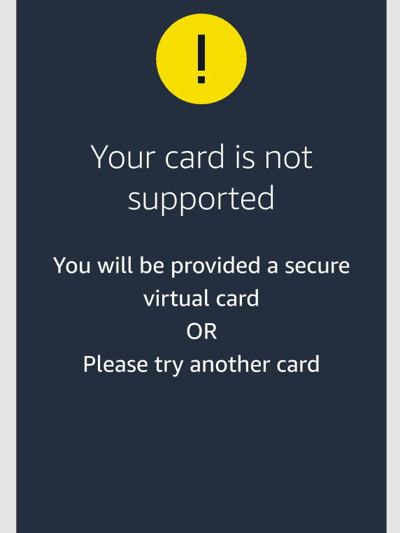
When the customer inserts a card that is not accepted, however, we must find a path forward for them.
("Not accepted" meaning Amazon One does not have a partnership in place with the customer's bank. This is not a solution for customers with expired, closed, or otherwise unusable cards.)
Not only must we find them a path, we must explain the problem and the solution we're offering to them. Preferably without trying to explain the concept of HCE.
The things we must explain are:
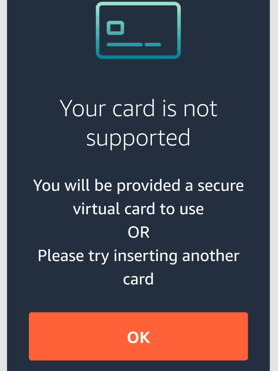
The card they inserted is not supported.
They can still shop using that card.
Amazon will charge their card (rather than Whole Foods making the charge, for example).
The charge will show up differently on their bank statement.
What needs fixing here:
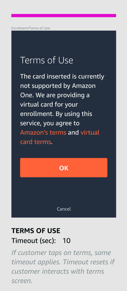
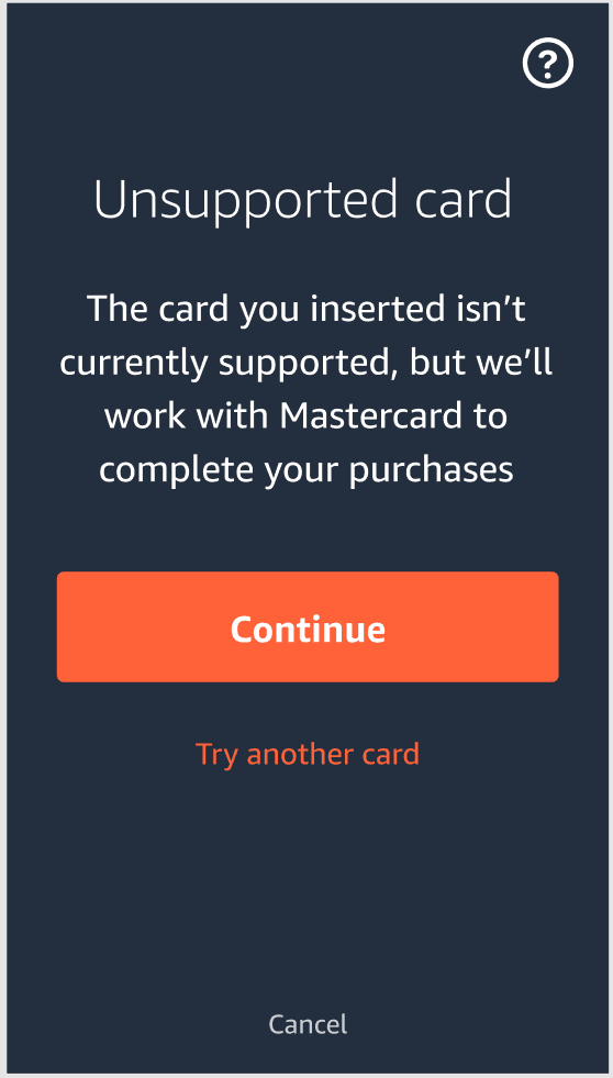
The screen's headline is Terms of Use, which is misleading because the customer may think they're agreeing to the standard Amazon One terms, rather than agreeing to the terms of using a "virtual card" provided by Amazon.
"The card inserted is currently not supported by Amazon One" is vague, jargon-y and robotic.
Amazon style avoids using "we" or speaking in the first person to customers.
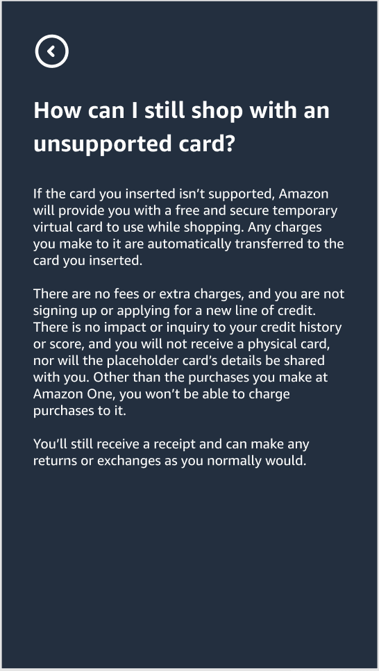
There is no definition or explanation of what a "virtual card" is.
This is referred to as a "service" but not explained at all.
The CTA is just "OK" so if a customer only reads the headline and CTA, they have no idea what they've agreed to. Potentially dark pattern overall.
Creative process: Exploring some options
Researching
First I dove into the topic, to better understand the product, its audience, and the industry landscape.
Brainstorming
Then I came up with multiple angles and possible directions with which the content can stand out from the crowd.
Writing the content
The magic happens at this step, when I sat down and wrote the bulk of the content. It might still need some refining at this point.
Editing the piece
While the content was written already, I like to do two editing rounds to make sure it’s up to the highest standards.
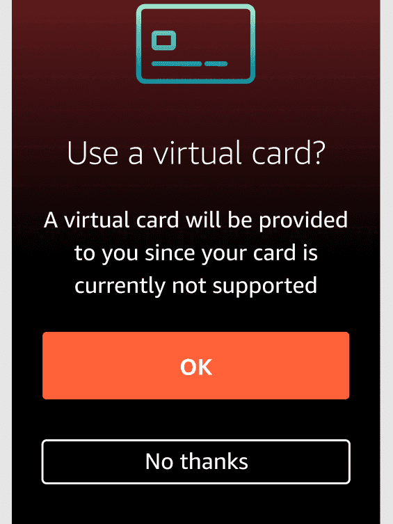
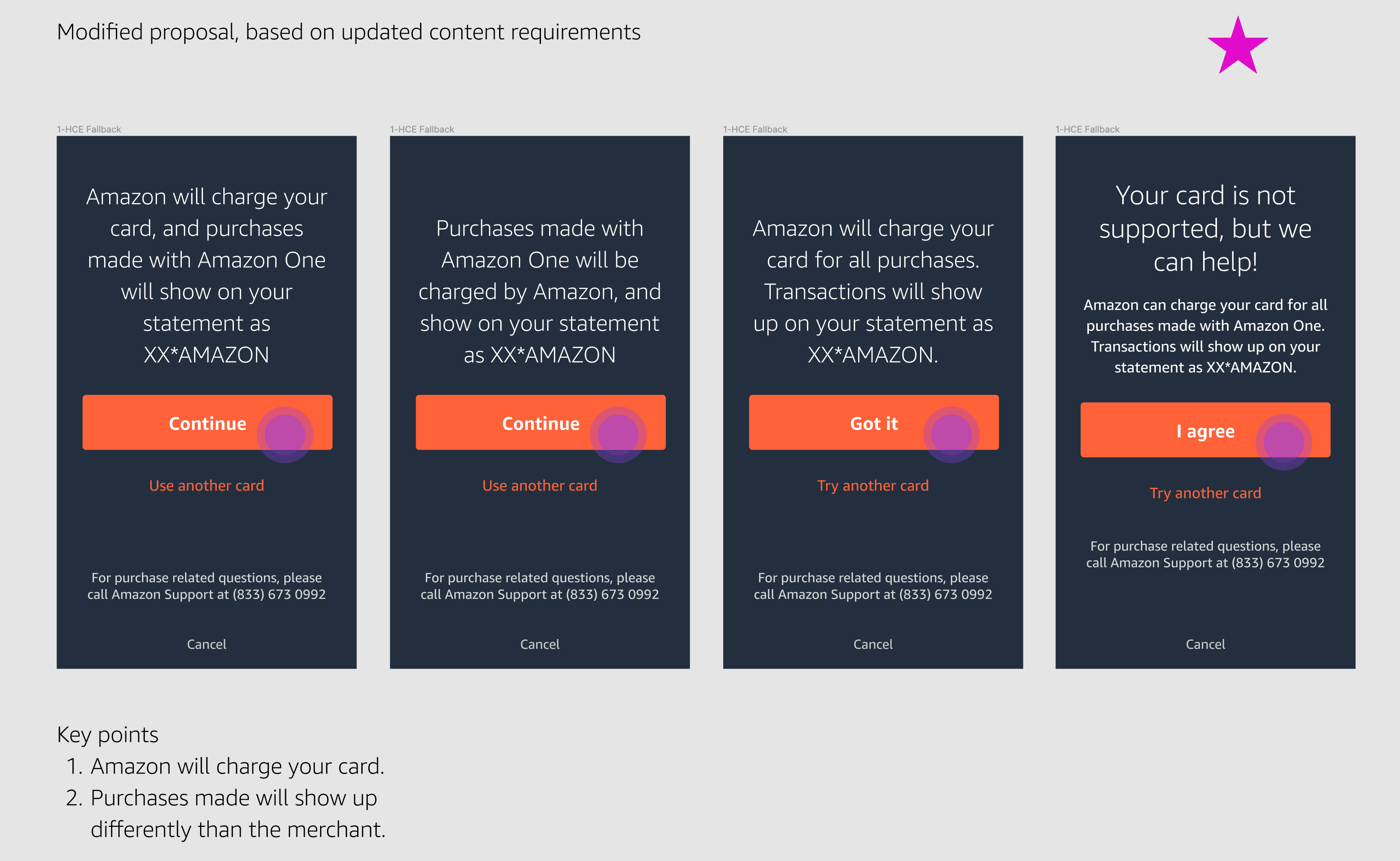
Then the leadership team threw me a curveball: We can't call it a virtual card.
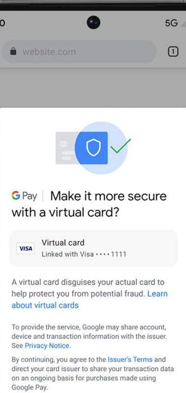
"Virtual card" is already a known term within GPay, and it functions differently than how HCE would function, so I was asked to come up with alternatives to avoid confusion.
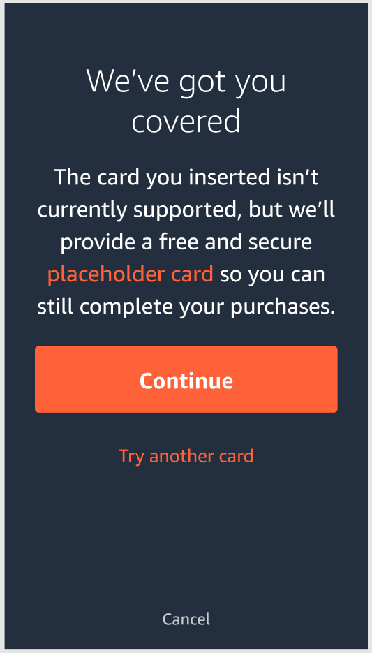
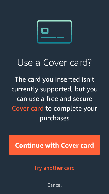
So I came up with a few other names, my favorite of which was Cover card.
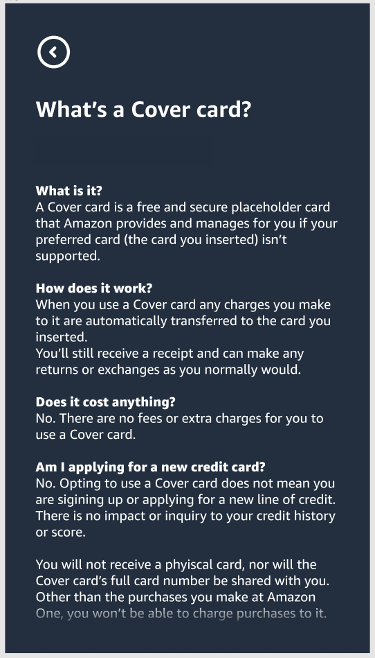
I advocated for Cover card primarily because I felt that it empowered the customer. When thinking about the entire customer journey, if a customer had an issue using HCE and wanted to call in to Amazon Support or their bank's customer service, they would have a very hard time explaining their problem without the proper lexicon. Giving it a name allows the user to reference it, become familiar with it, and trust it. It also presents the potential for Amazon to introduce a proprietary Amazon-branded safe payment method, even beyond Amazon One.
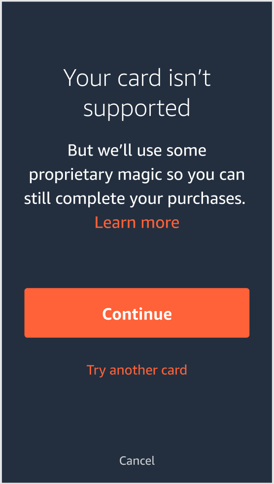
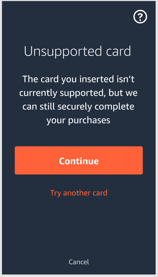
All the stakeholders were very excited about Cover card, but the director wanted to see versions that didn't have names.
Then I, along with 18,000 other Amazonians, was laid off.
Since I was no longer involved in this project, I will share the direction the team ended up choosing, and my opinion of it. The project was finished without a UX writer.
The following screens were not written by me.
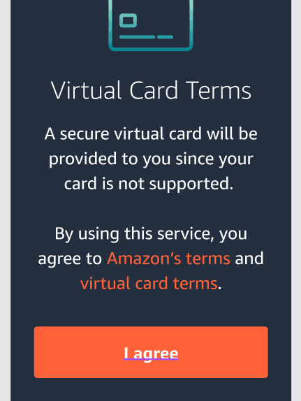
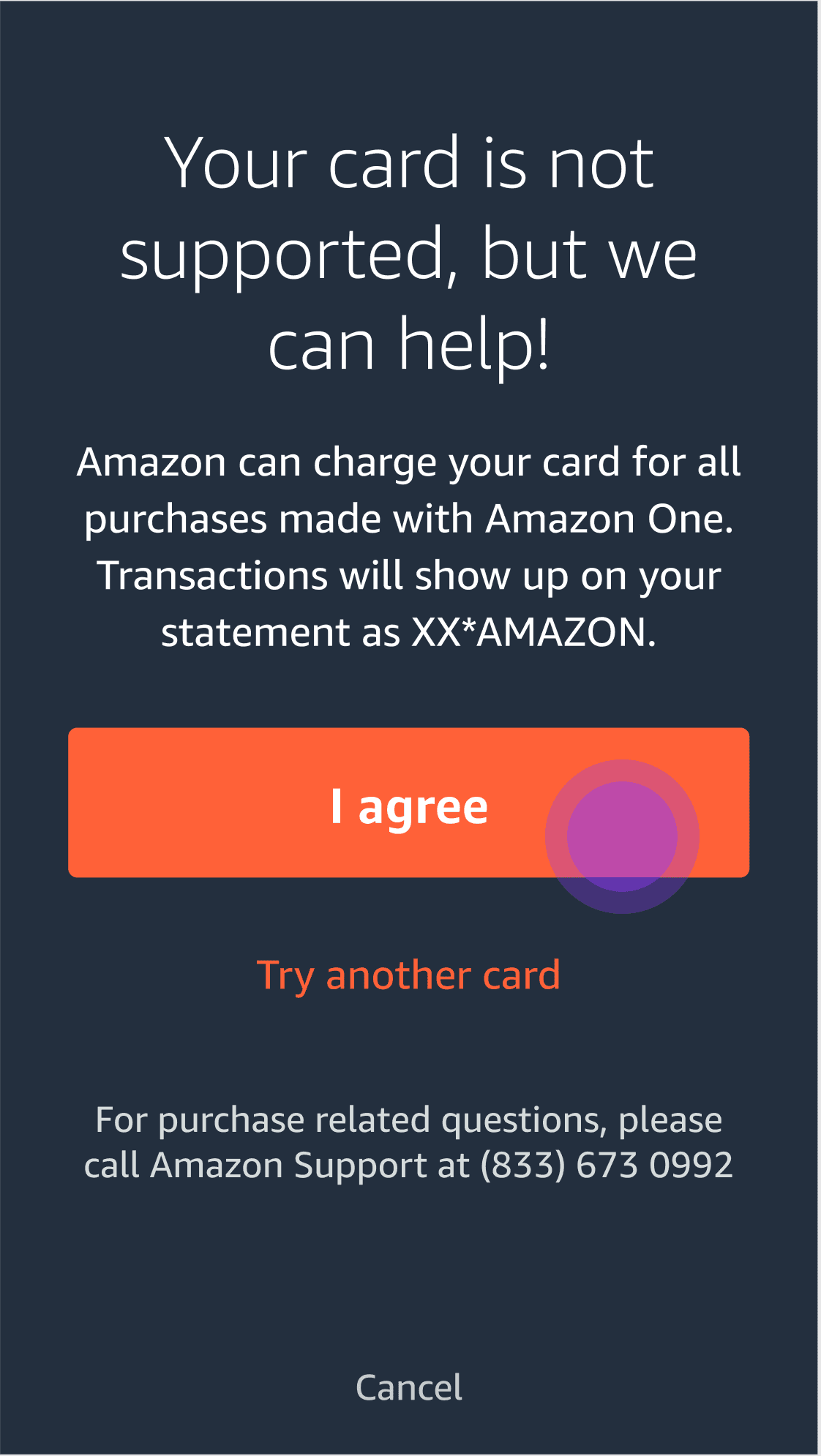
This is the screen they ended up choosing after my departure.
Here are my thoughts on this screen:
Headline breaks first person rule
Headline uses an exclamation mark, which is against style rules
The headline and CTA are unrelated to each other. Best practices dictate that the CTA should "answer"the headline so that even if the user doesn't read the body, they get the gist of the screen and what they're agreeing to.
The body is confusing, and raises more questions than it answers
I do like that they have brought in a dynamic text field to show the user what to expect explicitly
"I agree" is generally used for agreeing to legal terms, which don't seem to be linked here. What is the user agreeing to, exactly?
"Try another card" is a good alternative path
I'm pleasantly surprised that they included the support phone number here.
What exactly is a "purchase related question" (and why isn't it properly hyphenated?)

