New Feature Design, Branding, and Introduction
Hulu's Offline Download experience was one of my favorite projects to work on because I got to design its language from the start. Much of my work at Hulu consisted of iterating or updating existing language, but not with Offline Downloads. I was there for its conception, birth, and first words. And I named my baby Downloadable.
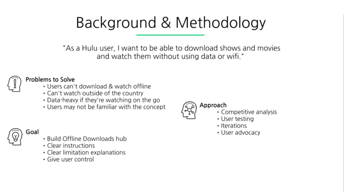
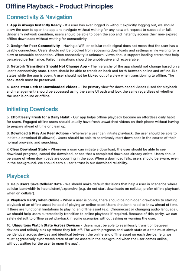
My team and I took some time to define what our goals were for this project, as well as what they were not.
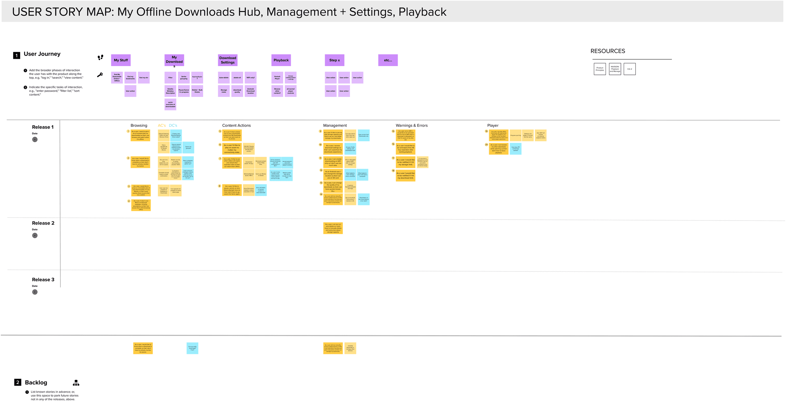
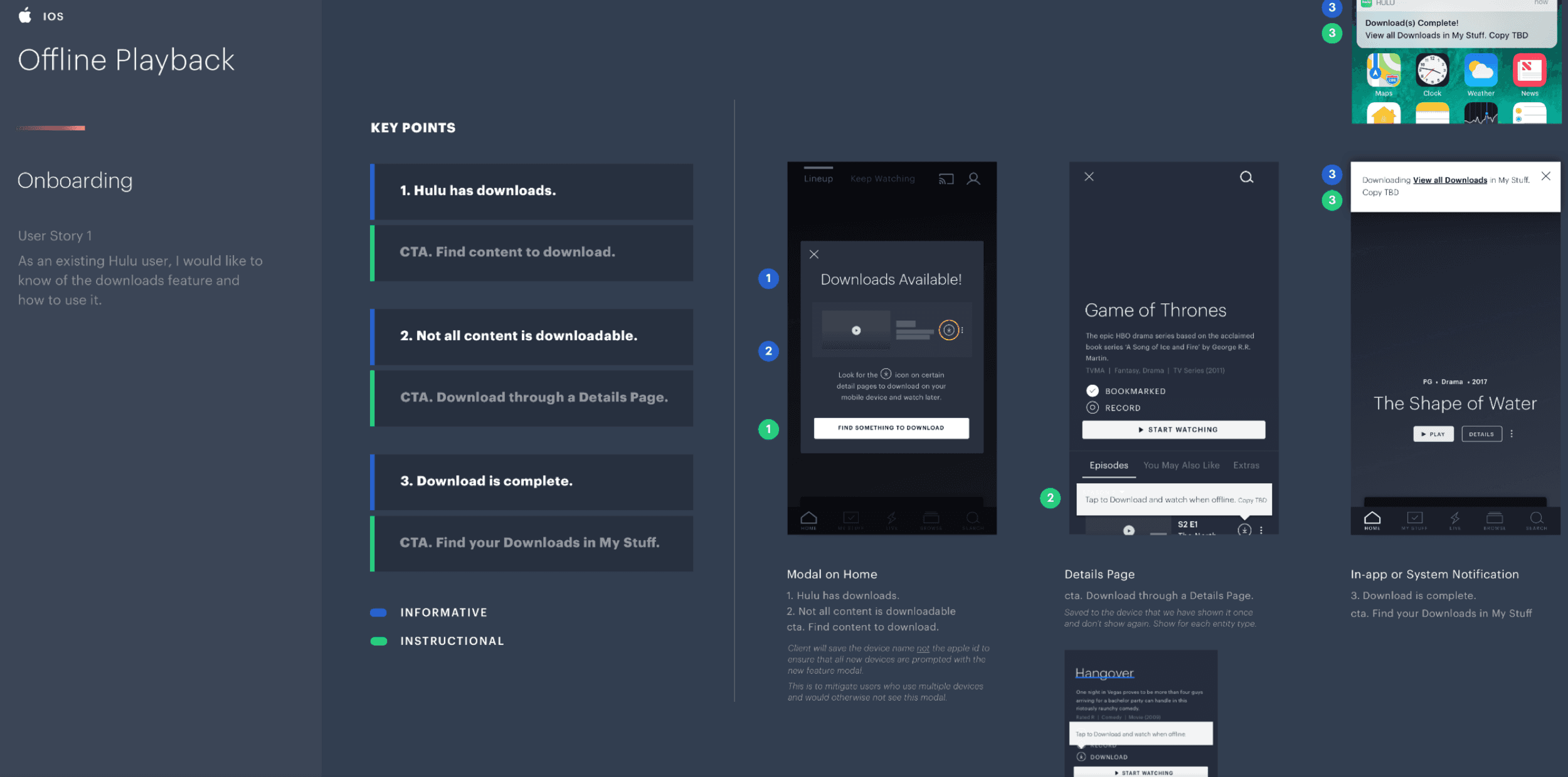
We spent a lot of time mapping the user's journey so that we could be sure we were designing firstly for them.
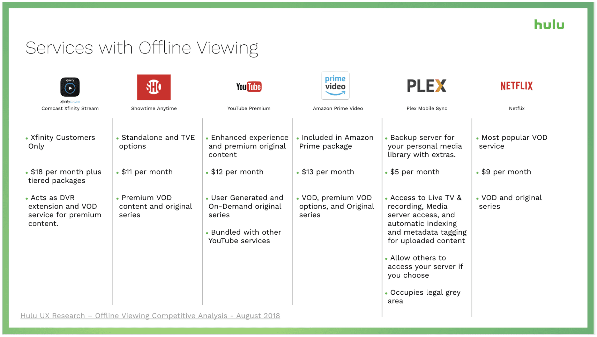
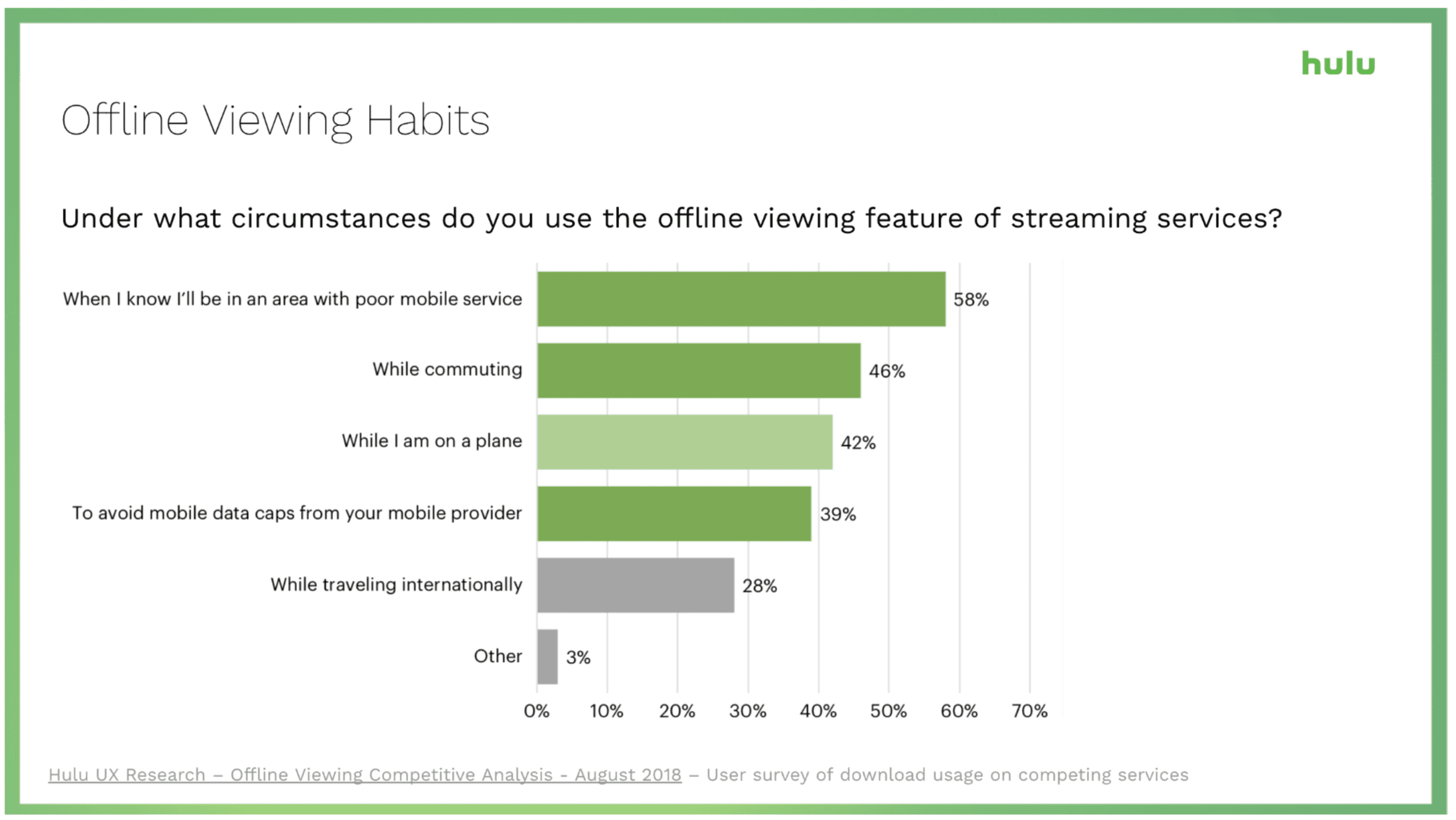
Our UX Research team provided competitive analysis data to inform our designs.
Market research was instrumental in our design decisions.
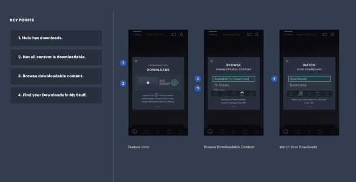
My hands-on began with these wireframes from the designer. They contained example copy indicating the key points for communication.
This 3-swipe style modal didn't end up making it into the final designs, but all the info it was to contain had to be kept.
Much of the FPO copy in the wireframes from the designer was verbatim from Netflix's downloads feature.
One of the challenges with this project was that not everything on Hulu was available to download. The FPO copy (and, by extension, Netflix) referred to the green-lit content as "Available for download" in user-facing copy.
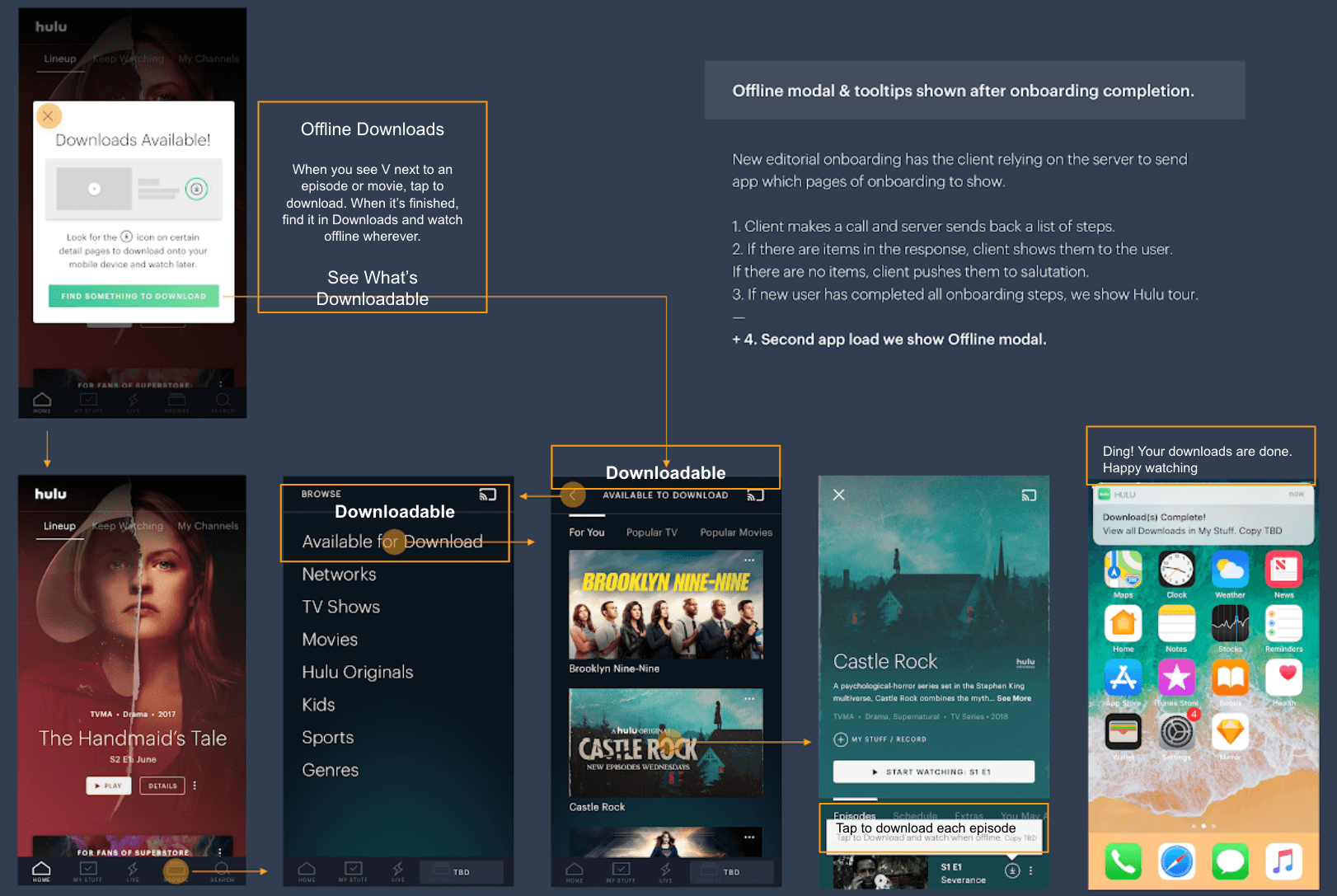
I needed to differentiate Hulu's experience from Netflix's, reduce character count, and make content that is available for download easily and quickly identifiable to the user. So, I invented a word: Downloadable.
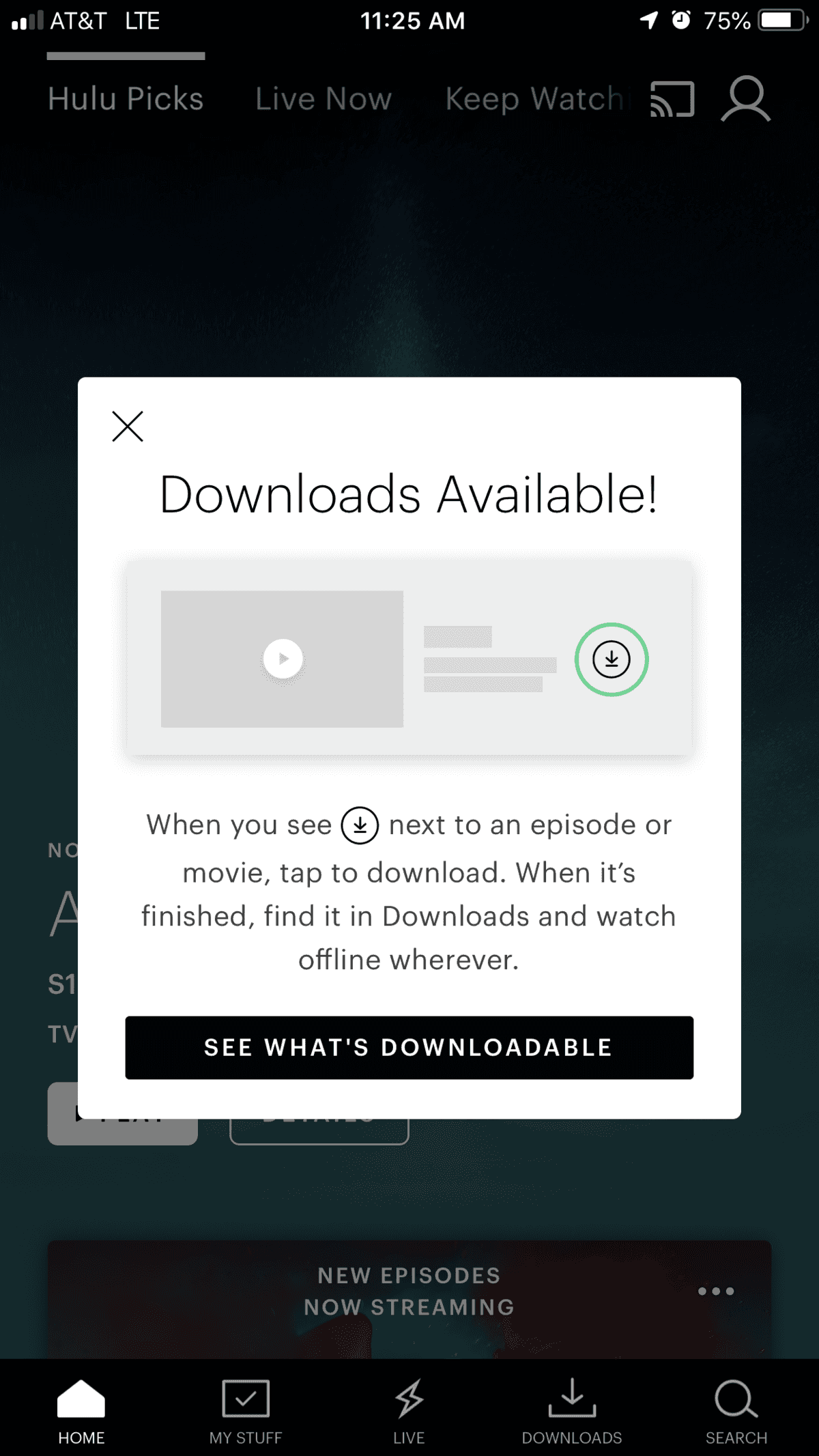
Tada! This is the final modal screen introducing users to the downloads feature.
Note the difference between the FPO CTA, "Find something to download" and my CTA, "See what's downloadable"
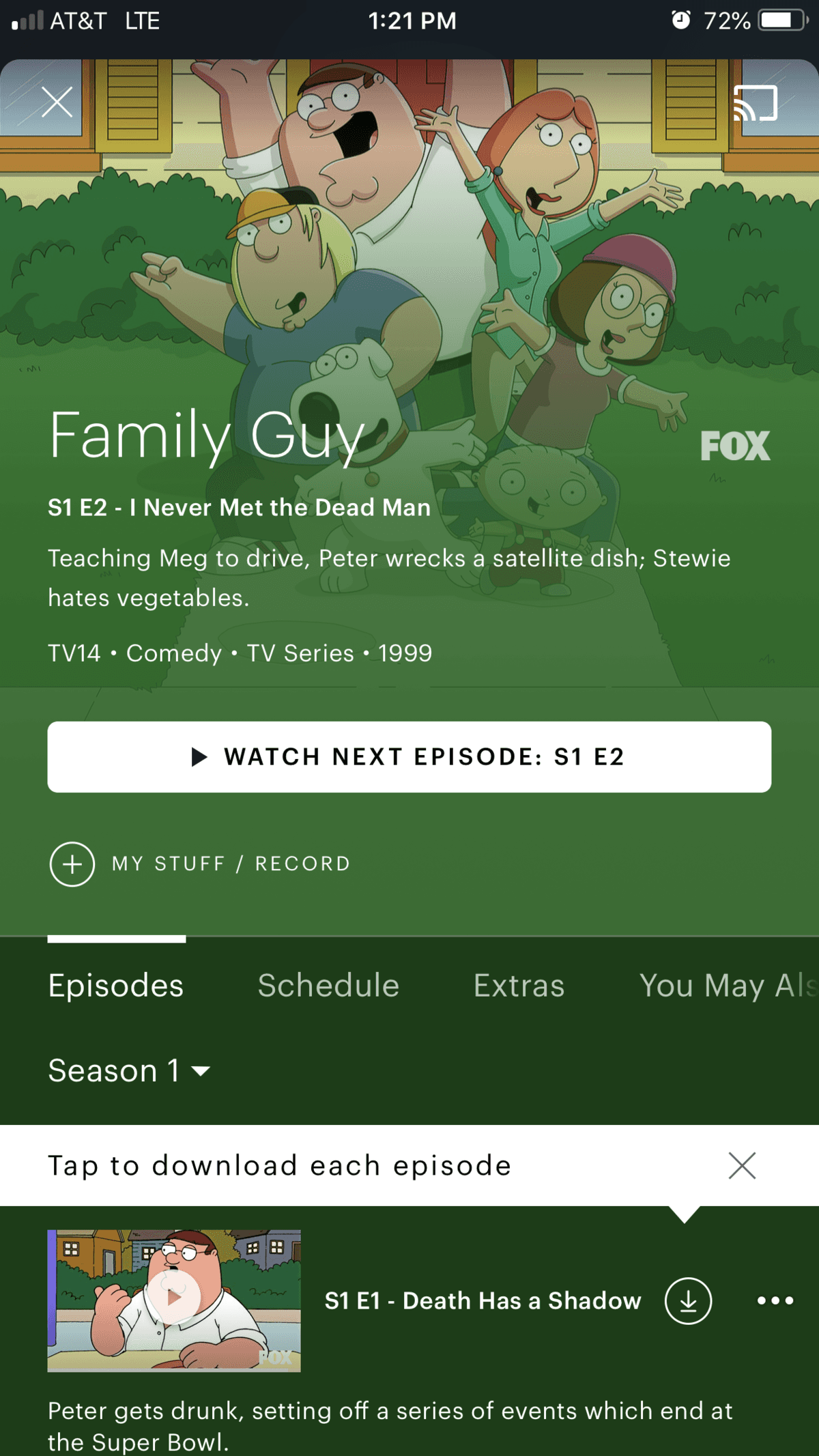
When the user first comes across something downloadable, they'll see this tooltip.
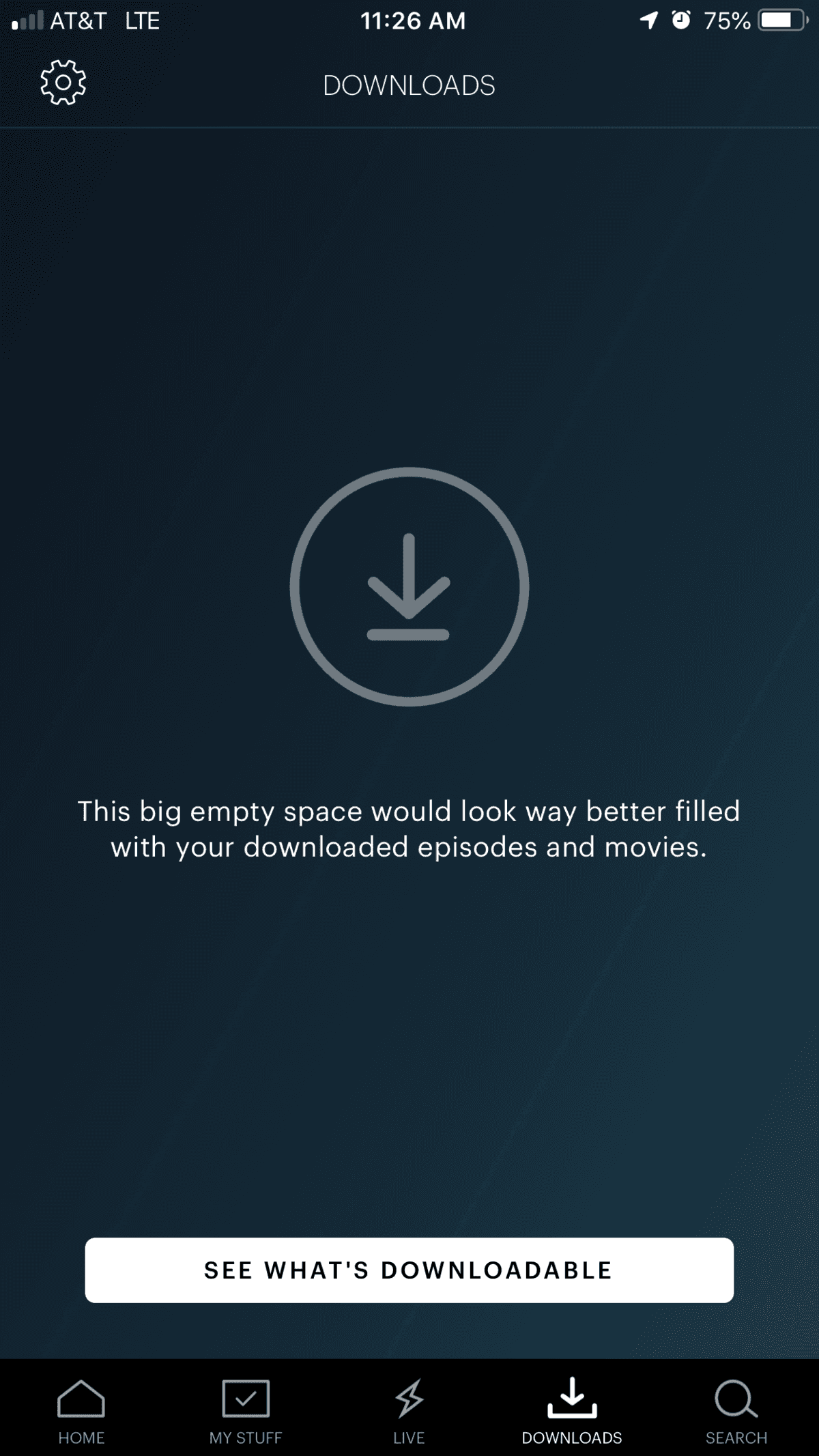
This is what the user sees if they have not yet downloaded anything.
Here is a demonstration of finding something to download.
And this is how a user can delete their download(s). I insisted that we tell the user how much space they'll free up. This amount is cumulative with bulk-deletions.
One of the bonuses of introducing the downloads feature is that we can provide the user an alternative when their internet connection is inadequate.
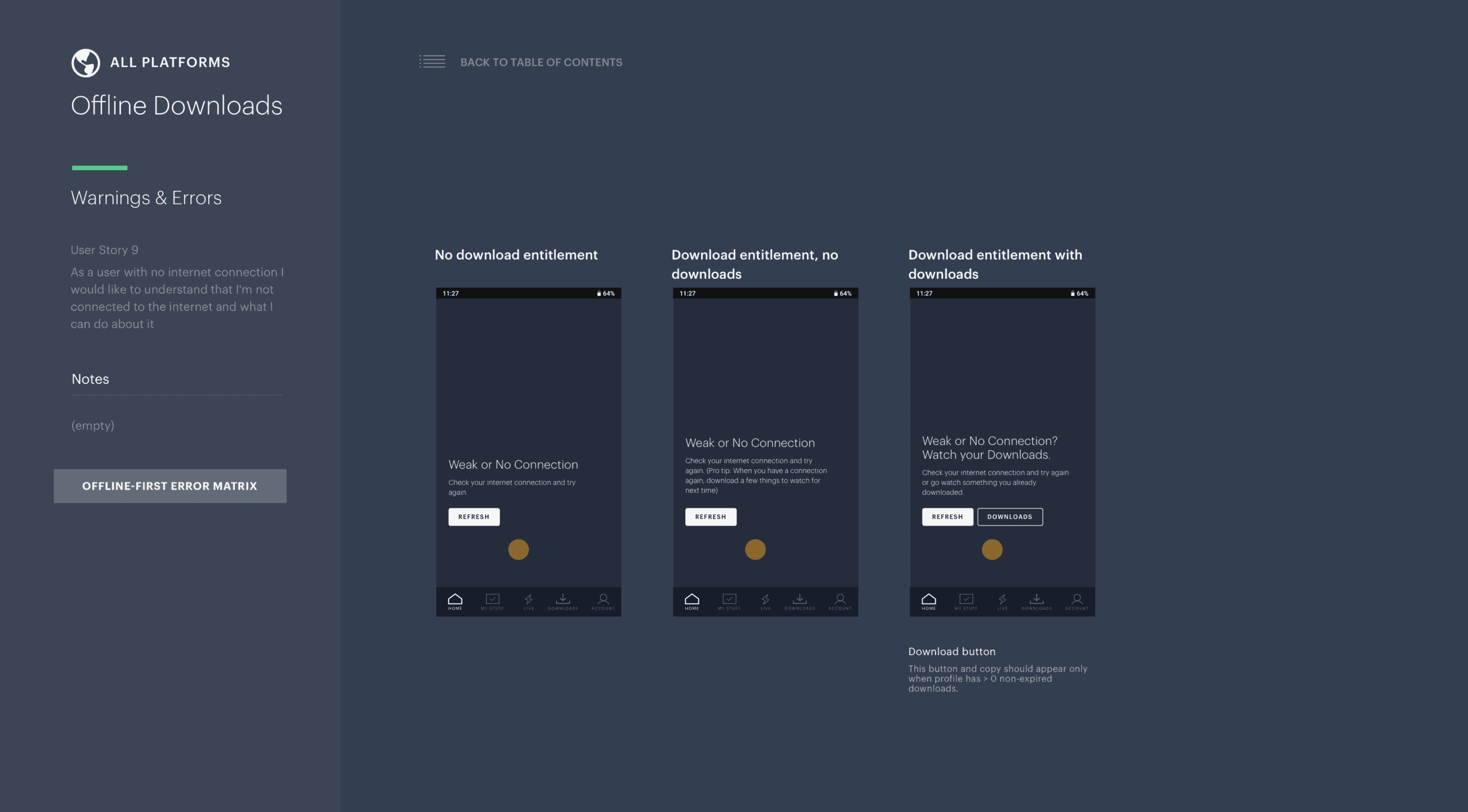
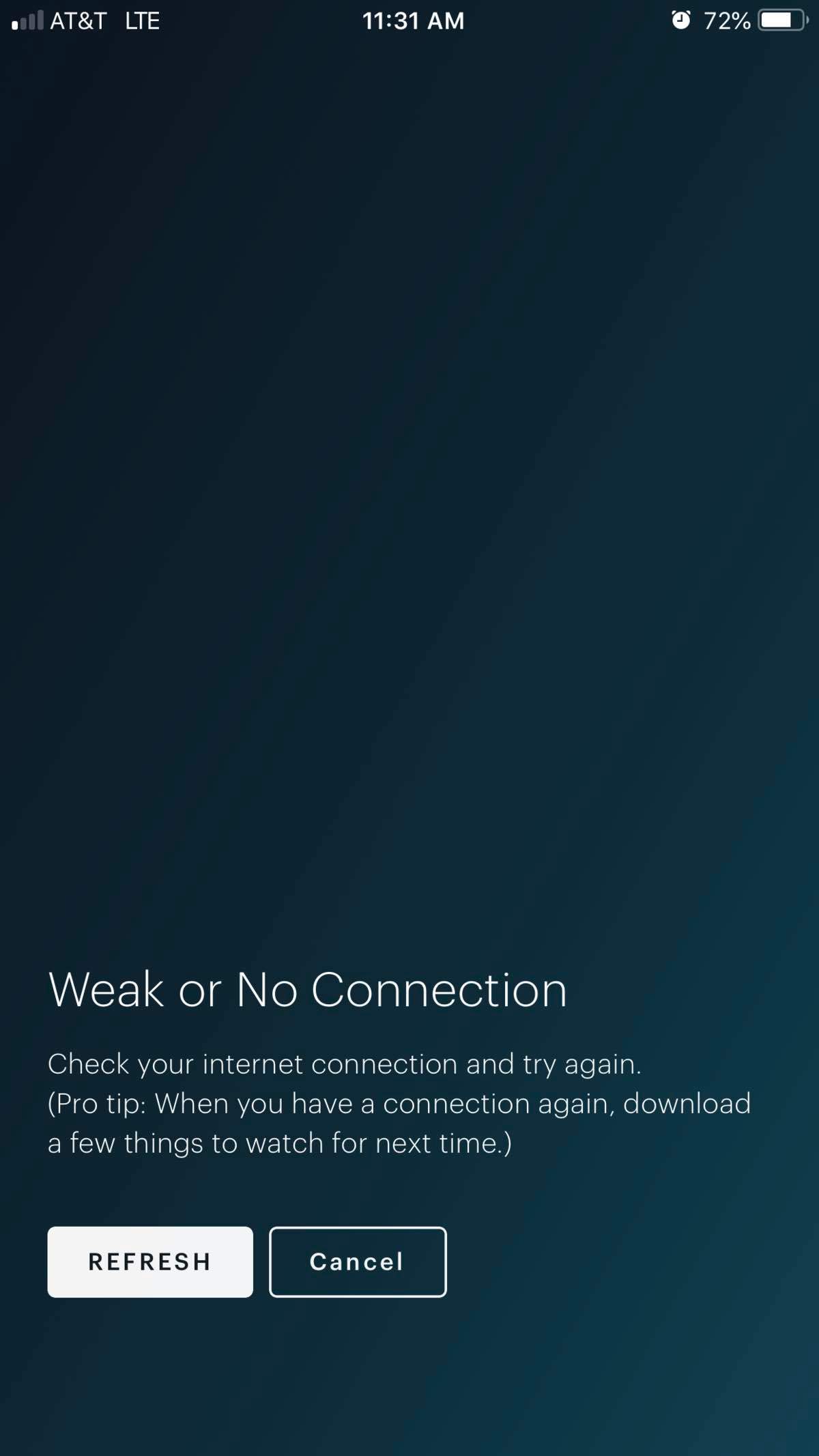
Offline Downloads is currently only available to users with the No Ads plan, so I had to write 3 versions of a Weak or No Connection error message.
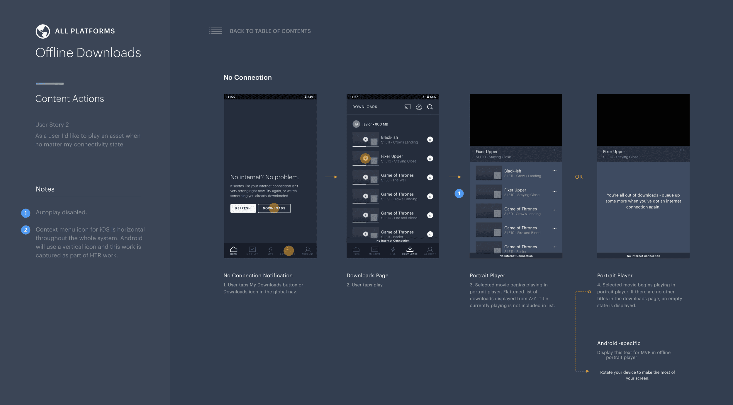
If a user has poor internet connection but has downloaded content available, we prompt them to watch something.
There is also an empty state message that surfaces if the user watches all their downloads and still has no connection.
If a user has a poor internet connection, has the Download entitlement, but doesn't have anything already downloaded, I give them a pro tip.
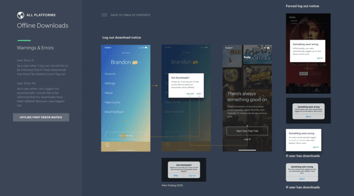
There are numerous Settings and Errors that needed to be written to accompany this new feature
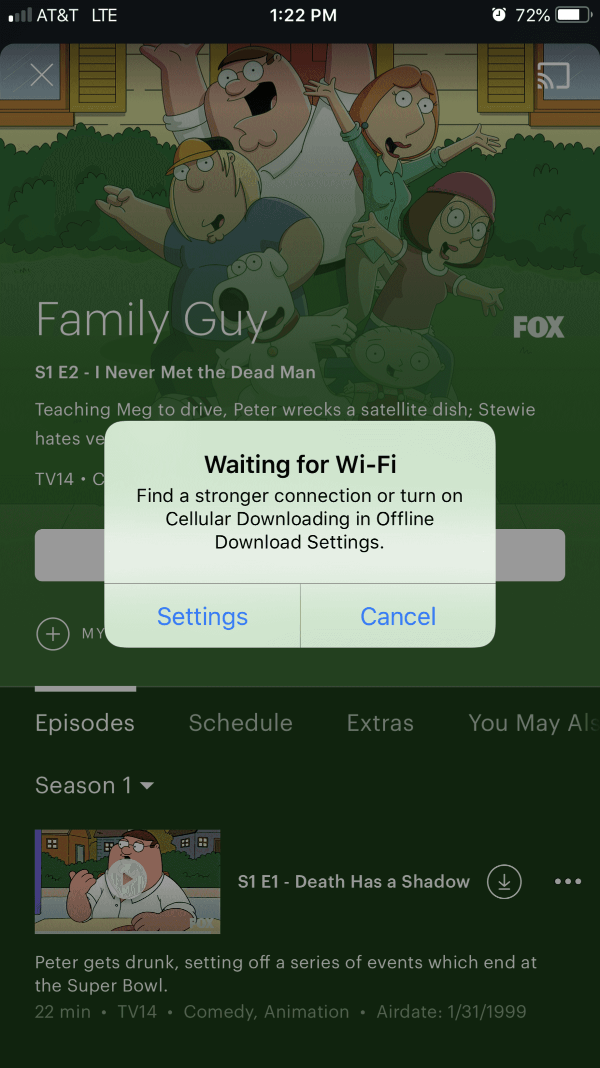
If a user has no wifi and tries to download something, they can choose to turn on cellular downloading, which is off by default to protect their data use.
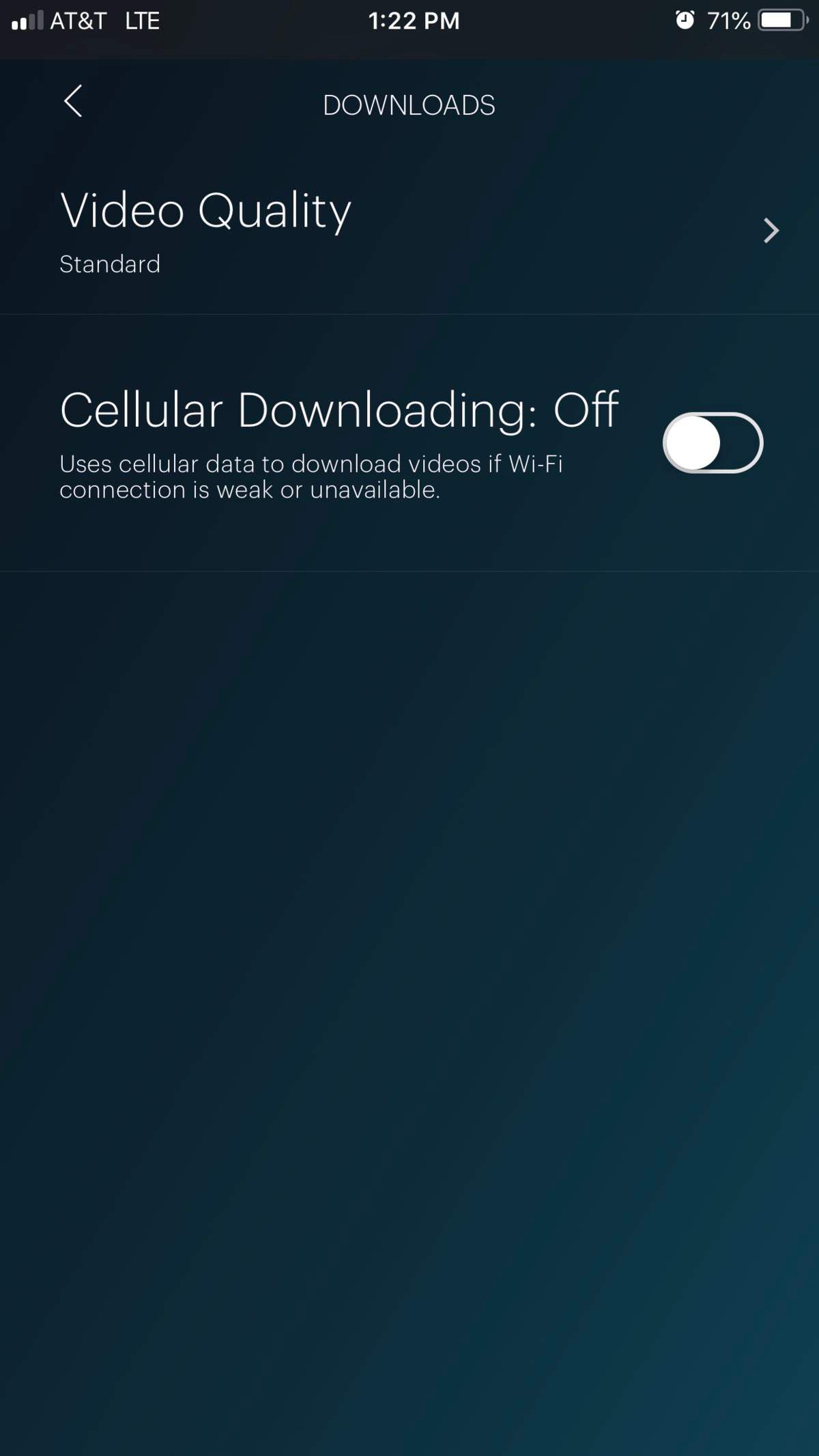
Here is a toggle option explaining Cellular Downloading
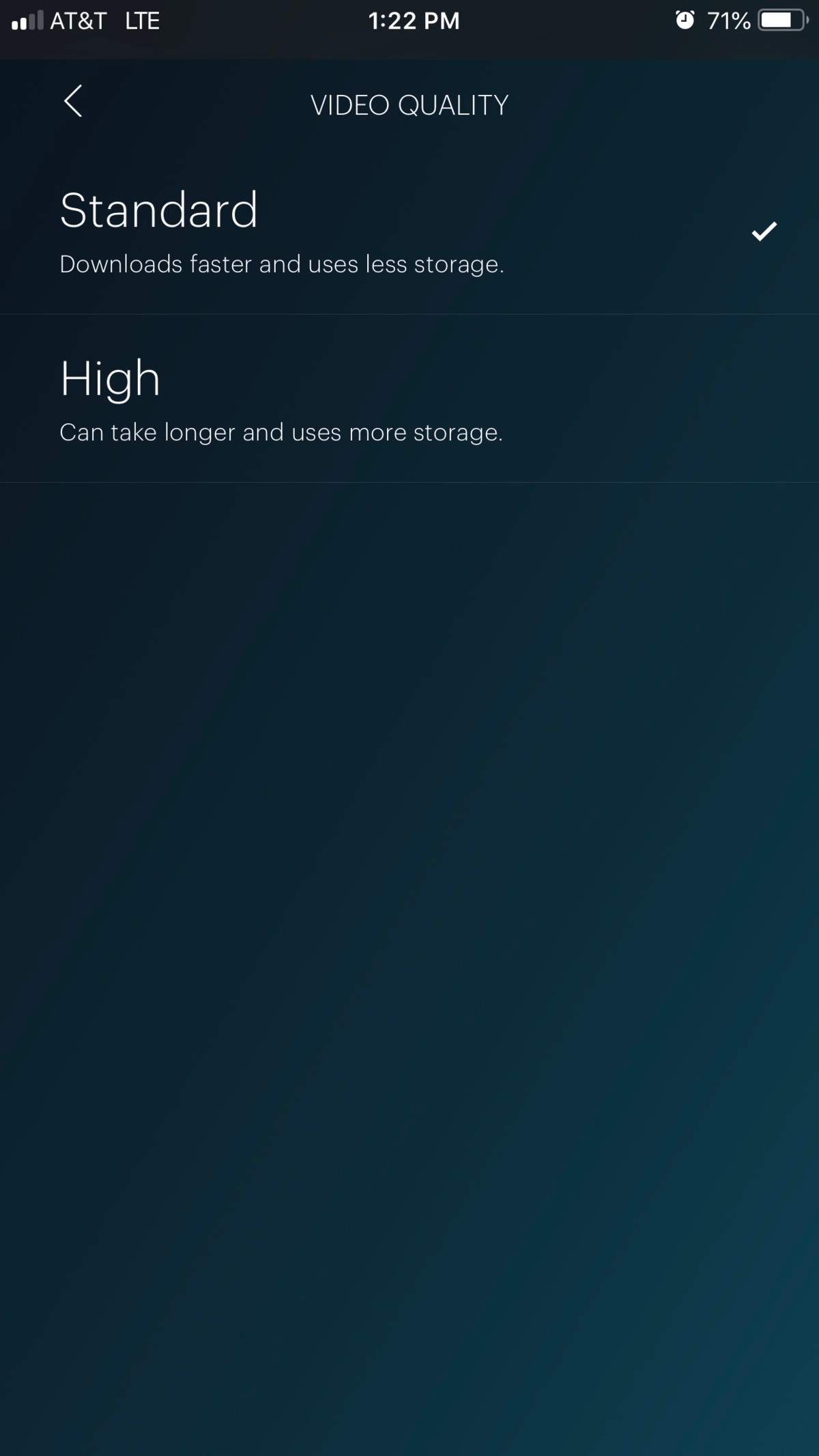
Here are the options for Download quality. I wanted to be sure to include the "why" for each option.
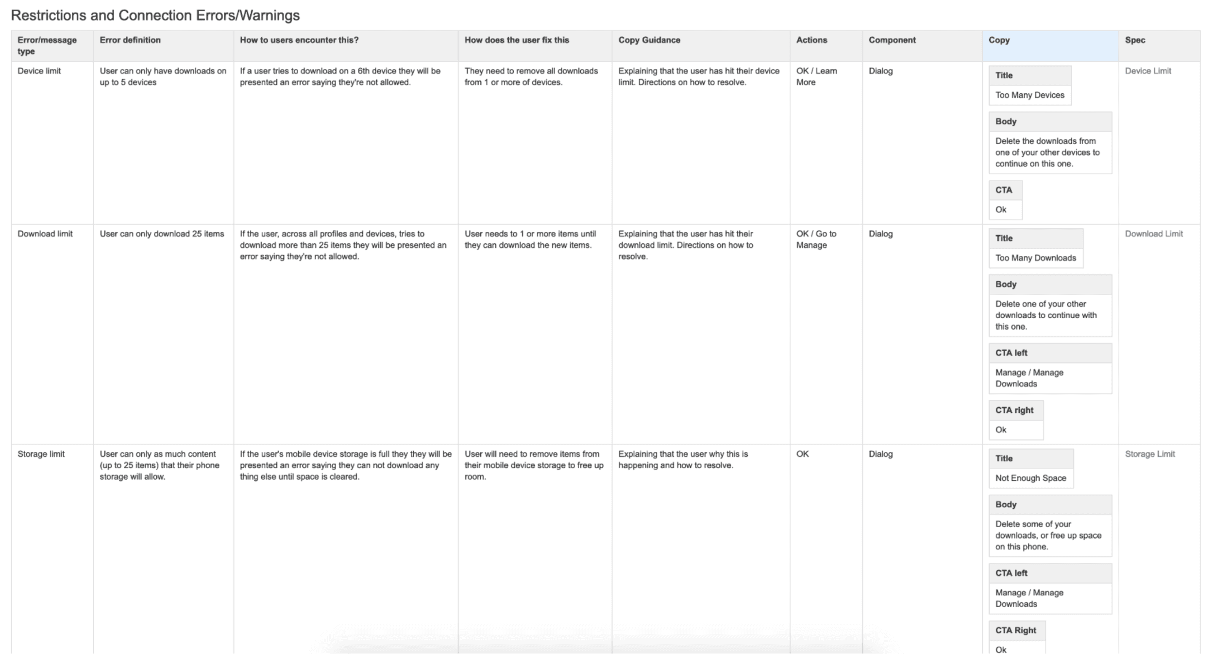
This is the matrix I created to inform the error messaging particular to Offline Downloads.
A variety of accompanying error & warning messages.
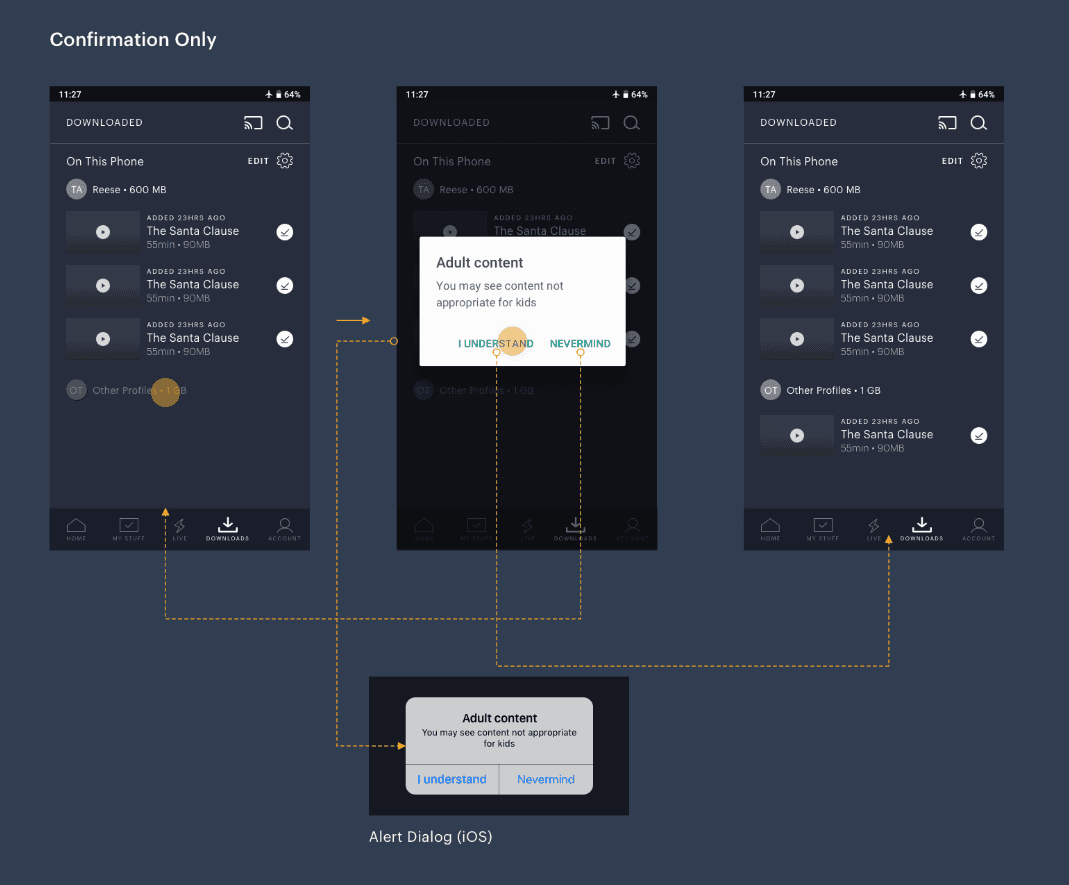
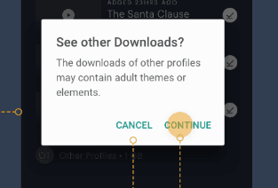
One of the challenges of the new Downloads feature was how we might prevent a child from watching the downloads of an adult's profile.
After discussing the limitations and cost of multiple designs, like a PIN/Password protection, we compromised on a modal confirmation.
Due to legal concerns, I couldn't specify an age (like: Are you over 16?) so I had to work around!
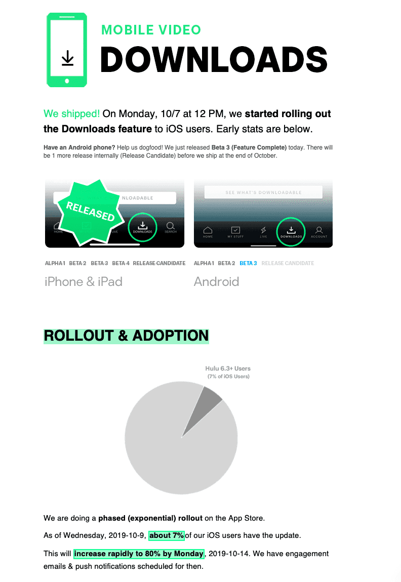
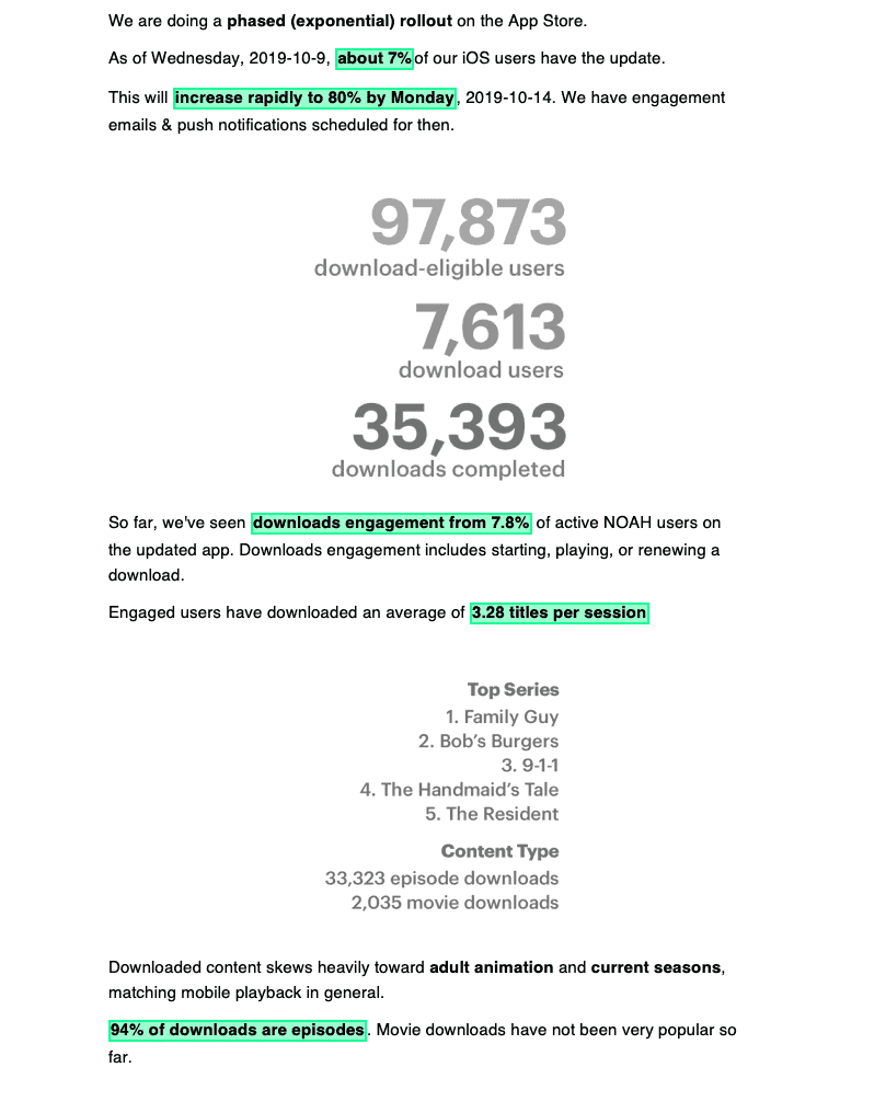
These are some of the initial specs 2 days after the limited iOS launch on 10/7.
Offline Downloads is now available on iOS and Android, and has 13 million total downloads (10/7/19 – 12/31/19)
