User-centric Design
Hulu's original onboarding experience for Live TV was extremely long, not very interactive, and asked users to make decisions about things with which they had no familiarity. They were asked to "Pick things to add to My Stuff" without ever being introduced to what 'adding to My Stuff' means, what it does, or why they should do it. That's a major problem.
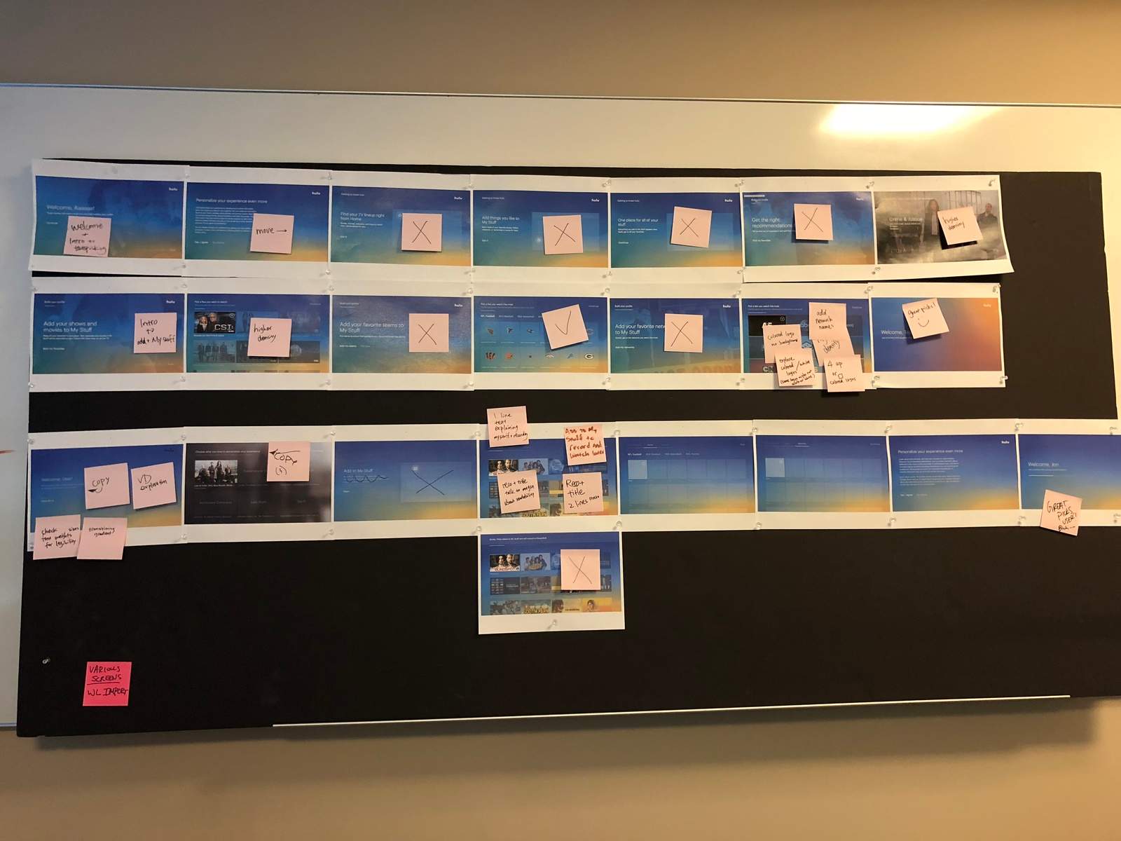
Hulu's original onboarding experience was a whopping 15 unskippable slides long

Screen 1. Wall of Legal Text
Screen 2. Welcome
Screens 3-5: "Tour Points" explaining Hulu's UI before the user is ever even given a chance to see it.
Screen 6: Import existing Watchlist. (This would only show for users who have had a Hulu account before.)
Screen 7: Tastepicking Primer containing the instructions for the next screen
Screen 8: Tastepicking Activity
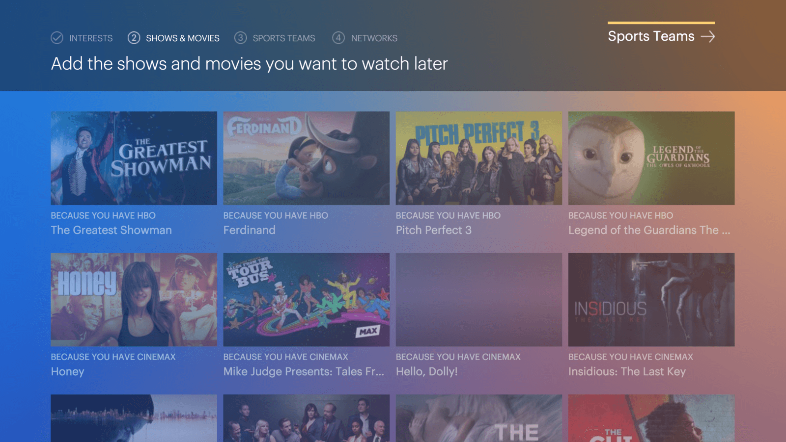
Screen 9: Shows & Movies Primer
Screen 10: Shows & Movies Activity
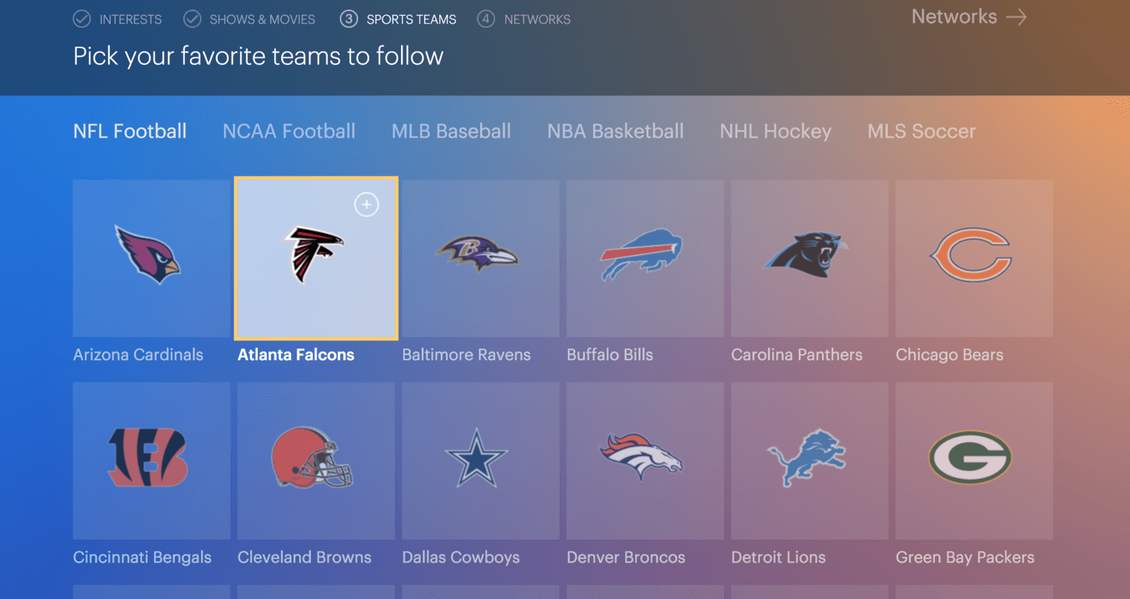
Screen 11: Teams Primer
Screen 12: Teams Activity
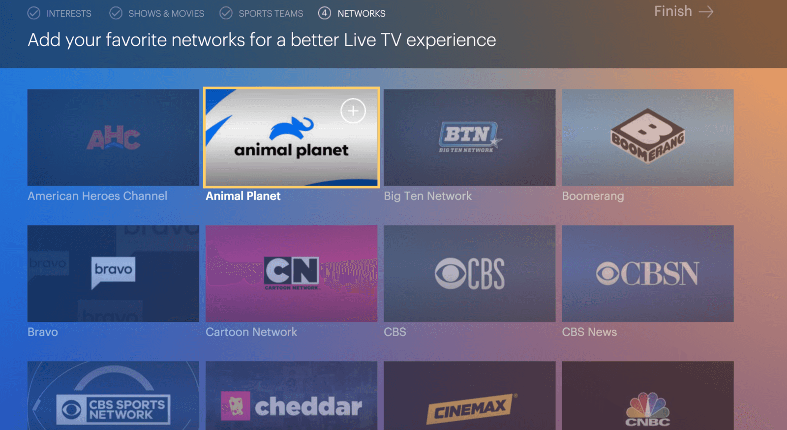
Screen 13: Networks Primer
Screen 14: Networks Activity
Screen 15: Welcome
This method put a heavy mental load on the user, introducing them to proprietary terminology and asking them to memorize the value and instructions of each activity before allowing them to complete it. No bueno.
Also, it was like, really really long.
Baby's first haircut!
We redesigned the onboarding experience from top to bottom. I consolidated and rearranged screens and activities to give the user more context, control, and education of the language and interaction models they would experience within the product.
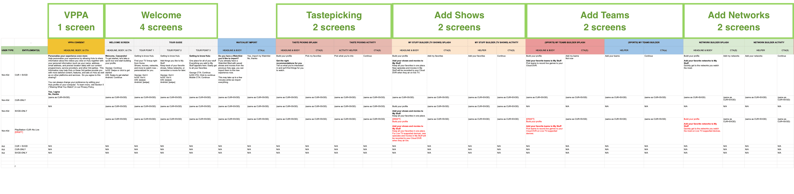
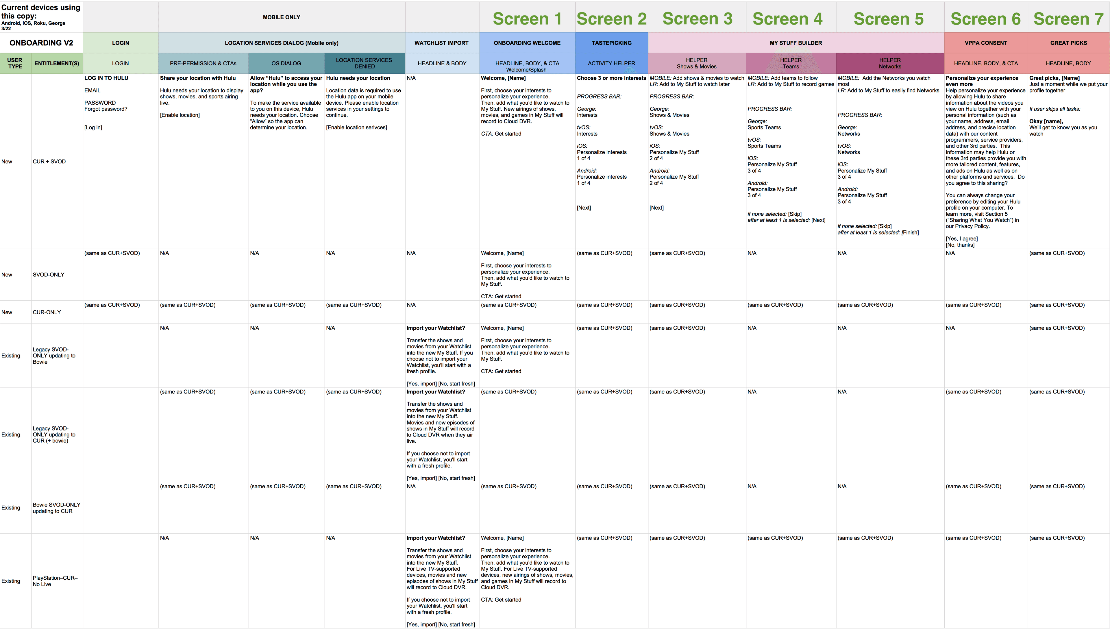
From 15 screens to 7
(the user only gets one of the last two. I promise I can count.)
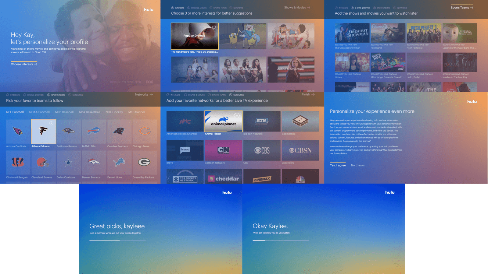
Screen 1:
Anatomy of the Get Started screen
Headline: Conveys value to the user
Body: Fulfills legal disclaimer requirements
CTA: Readies the user for the first activity
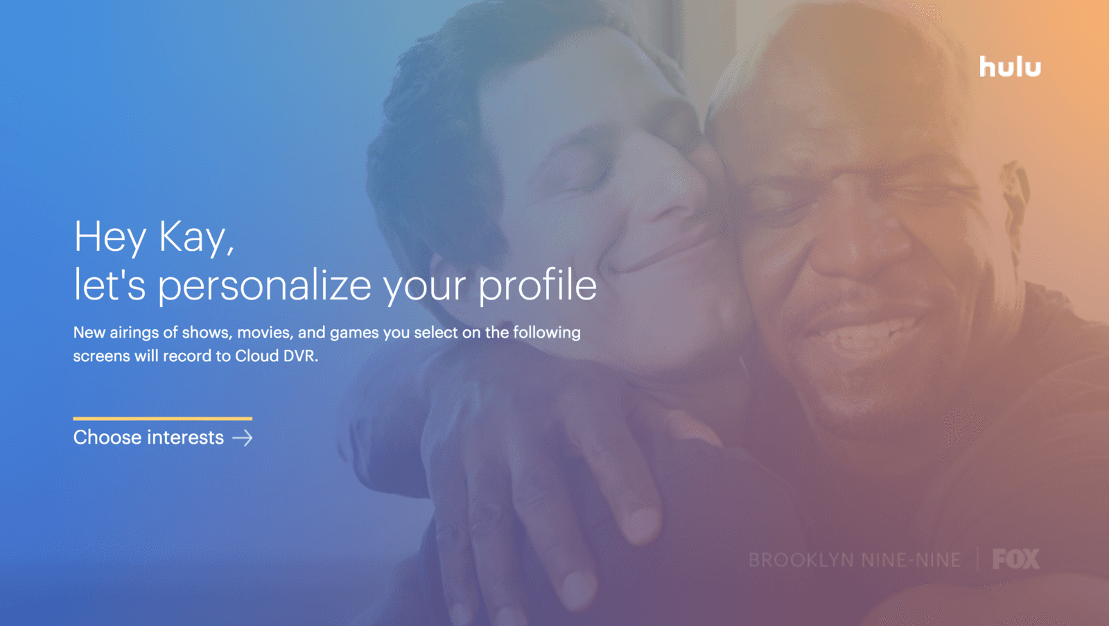
Screen 2:
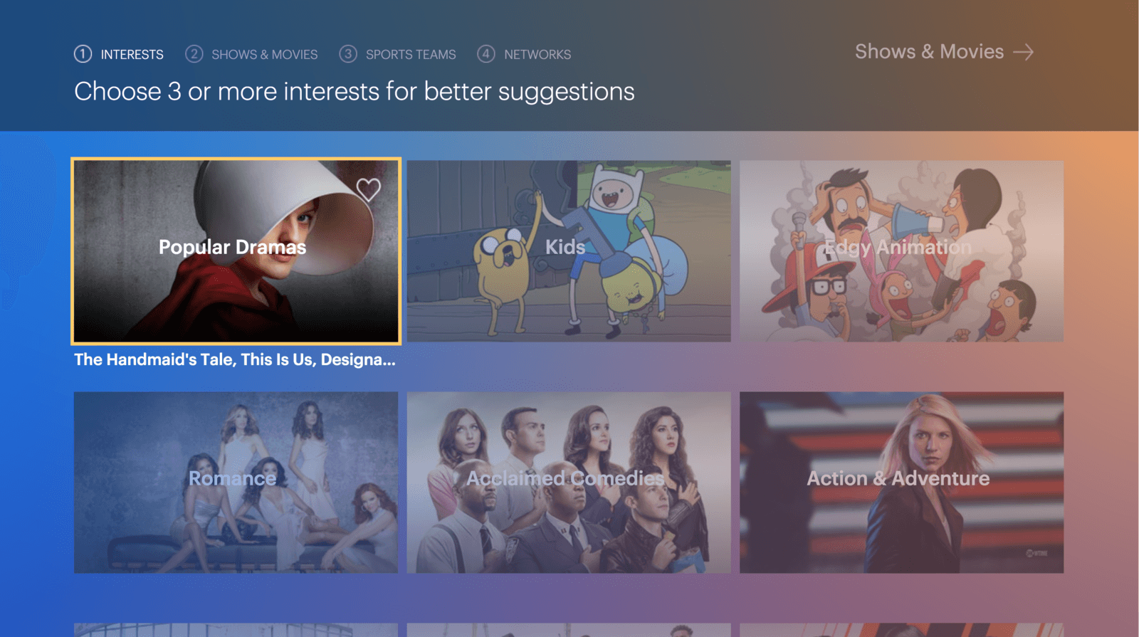
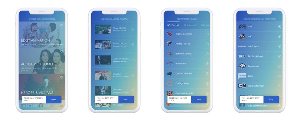
Taste-picking (an internal term)
Contextual progress bar orients user.
Instructions specify minimum number of items to select and communicate the benefit of doing so.
This is an integral step in suggesting relevant content to the user, so selecting at least 3 was required. After they select 3 tastes, the Shows & Movies button in the top right would become active, but they could continue picking additional tastes if desired.
Screen 3:
Intro to My Stuff
The hover state on tiles changes from the heart icon to the "Add to My Stuff" button. But, a new user doesn't know what My Stuff is yet, so instructions teach the user to use that button for stuff they "want to watch later". This activity is immediately skippable - there is no minimum number of selections and the CTA to continue to Sports Teams is immediately active.
There was talk of having the CTA be "Skip" if the user didn't add anything, but this was scrapped for two reasons:
1: Metrics showed users were 36% more likely to convert to paid subscriptions from their free trials if they added content to My Stuff in onboarding
2: Why tell when you can show? The CTA being immediately active indicates the activity is skippable, so using the space to tell the user what's next is more useful than showing and telling them it's skippable.
Screen 4:
Go, Sports!
Instructions communicate what adding a team will do. Since not everyone is a sports fan, this activity is immediately skippable as well.
Screen 5:
Live and let Live
The instructions on this page are different on mobile due to space limitations. On mobile, this screen says, "Add the networks you watch most".
This screen is also immediately skippable.
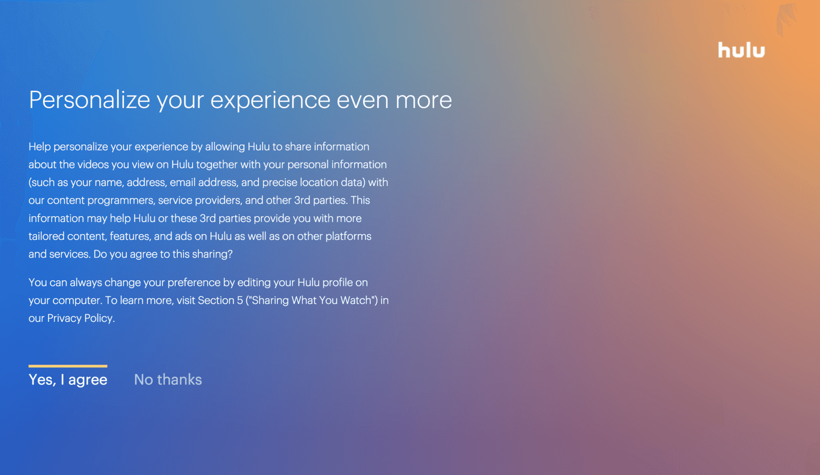
Screen 6:
VPPA
This lovely big block of text was a legal requirement. Unfortunately I was not permitted to edit or shorten it, but I did successfully convince legal to let me move it to the end of the onboarding flow, rather than the beginning.
Screen 7A:
Great picks
If user added shows, movies, teams or networks during onboarding, we get them excited and reassure them that all the effort they just put in is going toward creating a great personalized experience for them!

Screen 7B:
Taking it slow
If user skipped through all onboarding activities, we reassure them that they will still get a personalize experience: we'll get to know you as you watch.

Space on mobile was even more limited, but I managed to keep the language pretty consistent
Over 8 million users have been onboarded to Hulu on my copy.
We experienced a 10.4% lift in convert-to-paid users for streaming only, and a 12.6% lift in streaming + Live.
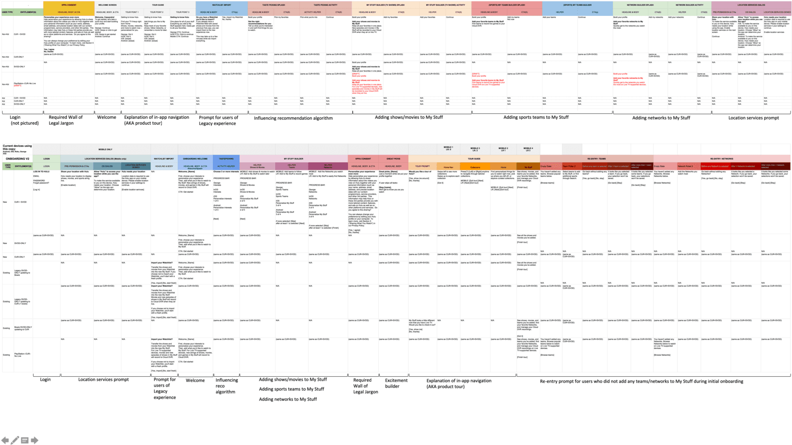
Welcome to the (Copy) Matrix
The top is the original matrix. While it may look shorter at first glance, almost every color section in the top was its own screen.
On the bottom is the copy matrix for the new onboarding. The blue and purple columns are onboarding screens, and the rest are product guide screens and re-entry experiences that are not required for onboarding.
Special Events Onboarding
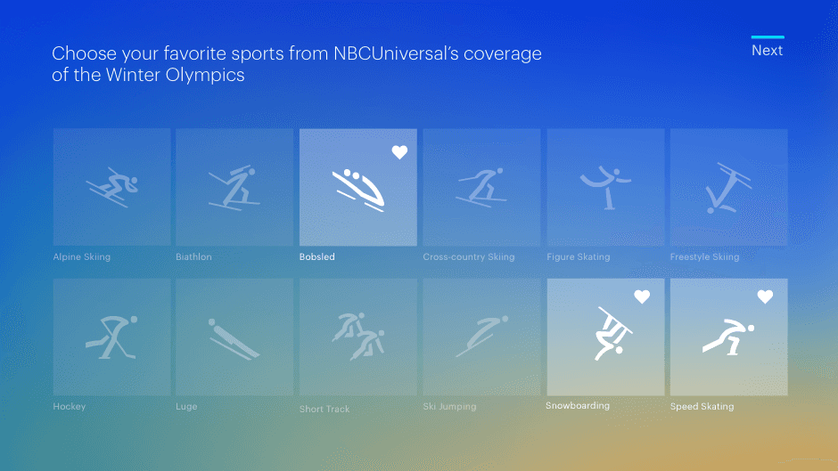
We also made supplemental contextual-based onboarding experiences for special events, such as the Olympics and March Madness, letting viewers choose their favorite teams and games to follow.

PyeongChang 2018
The Winter Olympics was the first contextual onboarding experience.

Who doesn't love Olympic Bobsledding?
NBCUniversal included strict rules in their contract around how the Winter Olympics could be mentioned and referenced. This ate into the headline and subheadline space significantly, especially on smaller devices (Spoiler alert: same with March Madness)
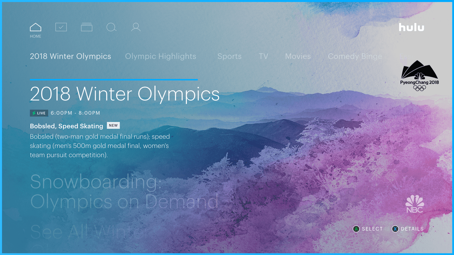
Not for Naught
Our users' work paid off: The Olympic sports they favorited were surfaced when they landed on Home, front and...left-justified, but still.
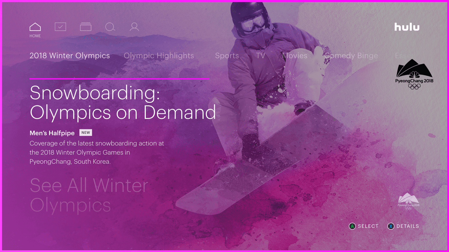
All the Snowboarding
Users' favorited sports were also amalgamated into custom collections, so they could just get the highlights
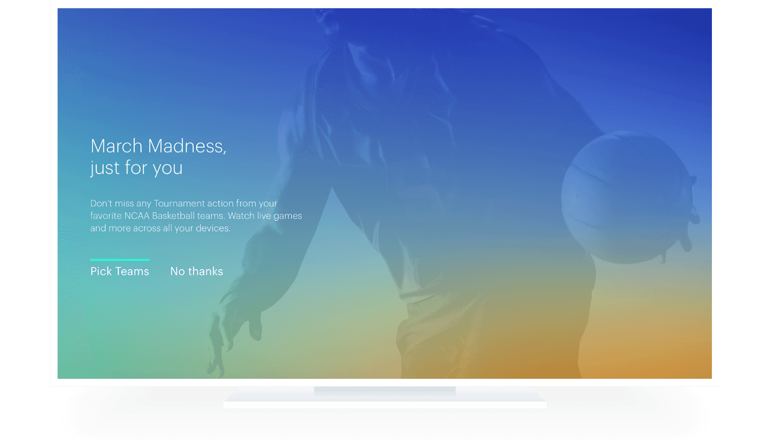
Taking the Mad out of Madness
March Madness onboarding prompt allows users an easy skip if they're not into b-ball.
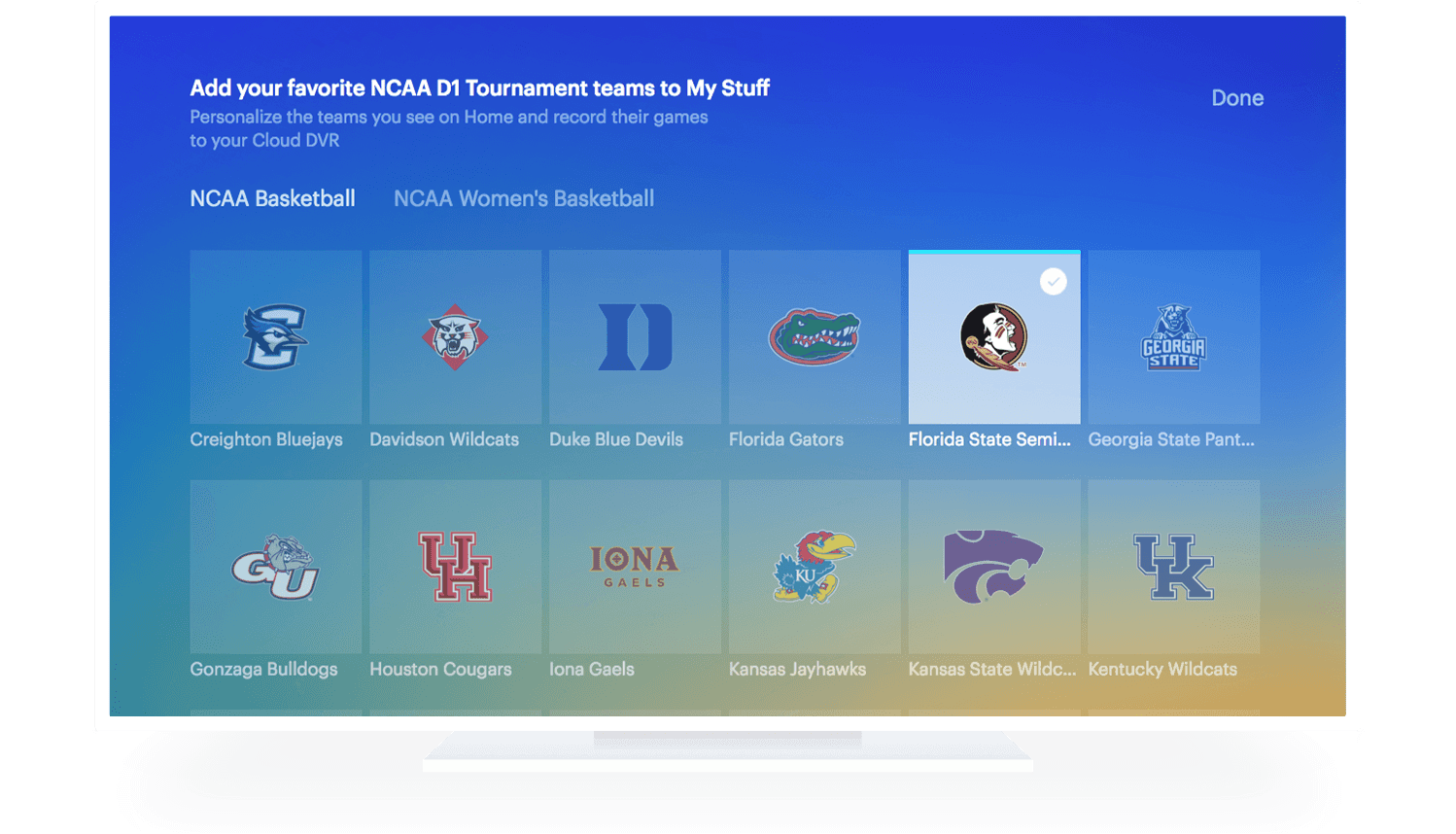
Pledge Your Alliances
Part of the legal requirement here was to convey that adding a team here would cause its games to record to a user's Cloud DVR.
P.S. Women's Basketball is Basketball, but I digress.
Honey, We're Home
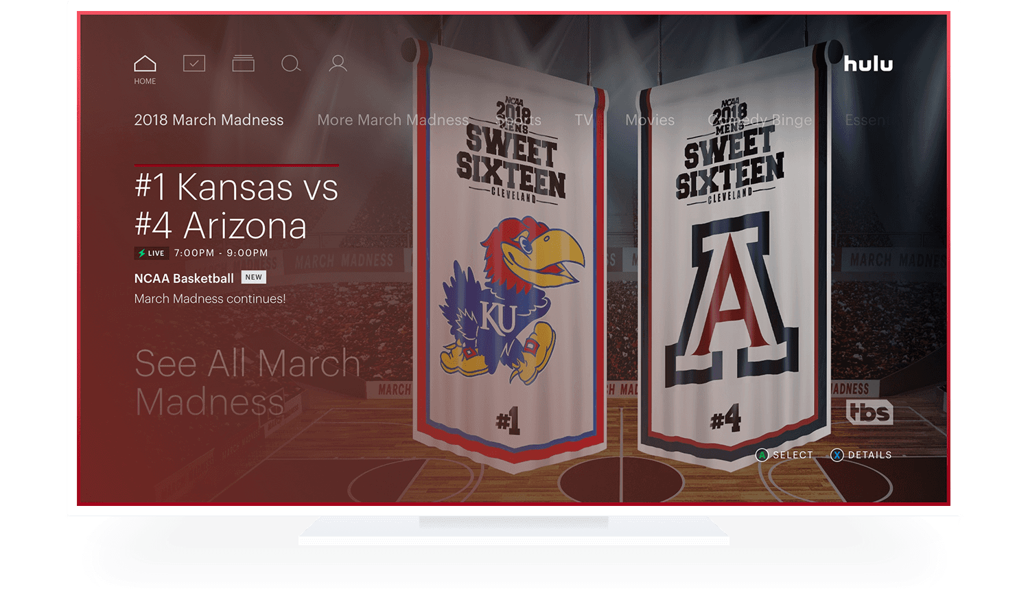
Teams added in the contextual onboarding were surfaced when users landed on Home.
Let the Games Begin
A total of 74K profiles participated in the March Madness onboarding activity.
(Duke, North Carolina, and Kentucky were the top schools, if you were wondering)

“
“Wowwww, SO innovative!”
― someone at FastCompany, probably
FastCompany 2019 #2 Most Innovative Company in Video
"The live-TV product has particularly innovated around big-event sports programming across its 50-plus channels. Hulu creates dedicated home screens for major events such as the Olympics, March Madness, and the World Cup, letting viewers choose their favorite teams and games to follow. Hulu also tailored its user interface to viewers' choices. More than 63% of Hulu’s live TV subscribers watched the Winter Olympics either live or on-demand, averaging 15 hours per viewer. It then built on that for March Madness, putting preferred games at the top of the lineup and automatically recording them. It also offered game start notifications for mobile devices. "