Dynamic Text Design
01 — Project details
I noticed the "Vacation Hold" screen had a very low success rate for diverting cancellations.
Also, the number of users who selected "Temporary - I'll be back" in the post-cancellation survey was surprisingly high. So I decided it was time to re-evaluate the Hold screen.
Hulu's original subscription hold option was only accessible through its cancellation flow. When a user selects "Cancel" in their account management, they are first prompted with the Pause screen (previously called "The Hold Screen" or occasionally referred to as "Vacation Hold" - misleading in its own right.)
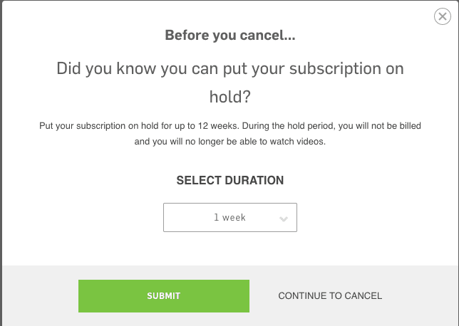
Original prompt
The original screen was vague, illogical, and misleading.
It made no mention of the fact that the hold does not start immediately, but rather on the user's next billing date. It forced the user to do math to determine when their billing would resume, and left the components of that equation vague ("12 weeks from today, tomorrow, or my next billing date....which is when, again?"). It offered very little value to the user, did not inform the user of their options to resume or cancel once on hold, and was used as an intentional roadblock for users trying to cancel. It wasn't even an effective roadblock - it had a very low success rate of diverting cancellations (<1% average in the 6 weeks preceding redesign).
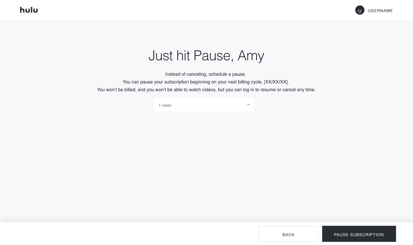
Get it?
"Pause"
Because it's TV!
Rewriting these screens involved working closely with Legal to ensure all relevant information was included and communicated, but in a human way. It also involved working with the designer for visual simplicity, accessibility, and usability; the product manager to ensure that what I was writing would be able to morph seamlessly into future iterations; and the devs to help determine the limitations around dynamic inputs and information calls.
Arguing the importance of dynamic dates being included here was key.
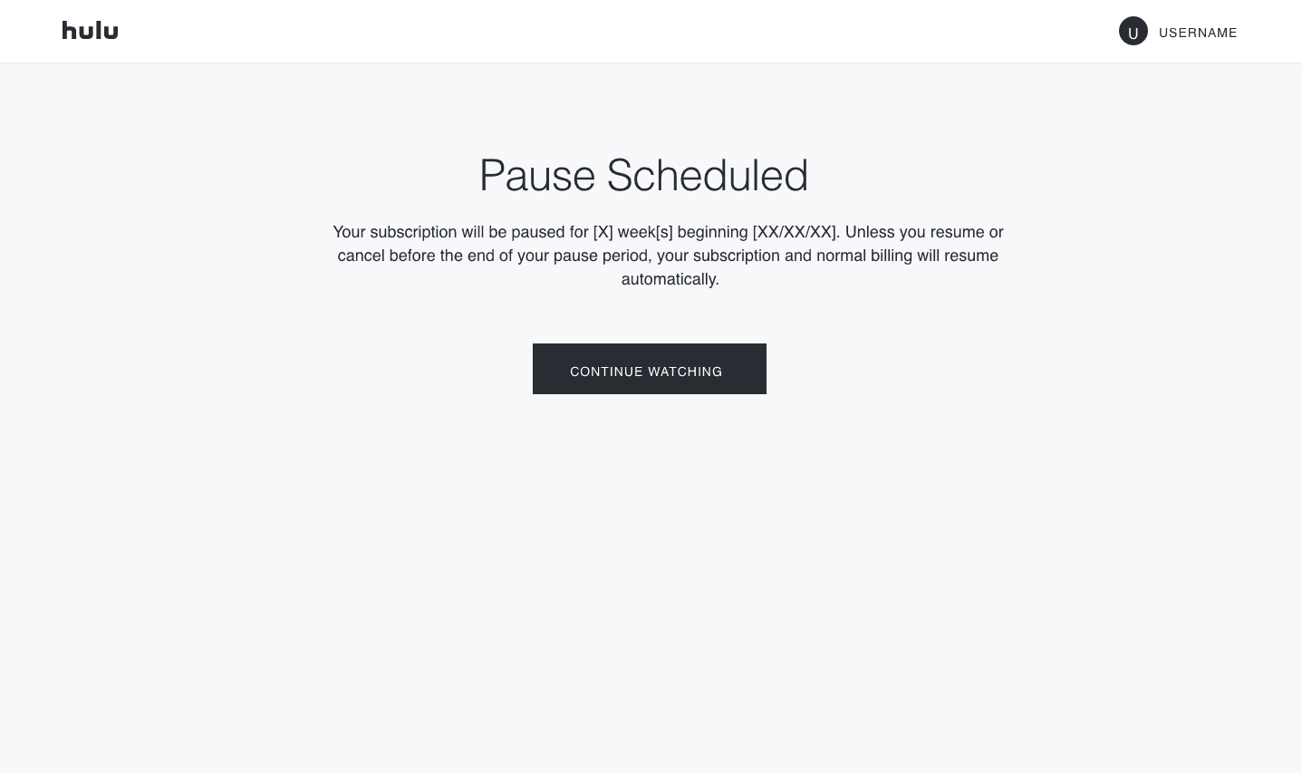
In the 6 weeks following the release of the redesigned Pause screen, pauses replaced cancellations by 22%.